3.2.25 - Preliminary Sketch
There are a lot of interesting ideas for elevated Rubik's Cube stands out there. I think the one that I feel most resembles what I want to do is this one.
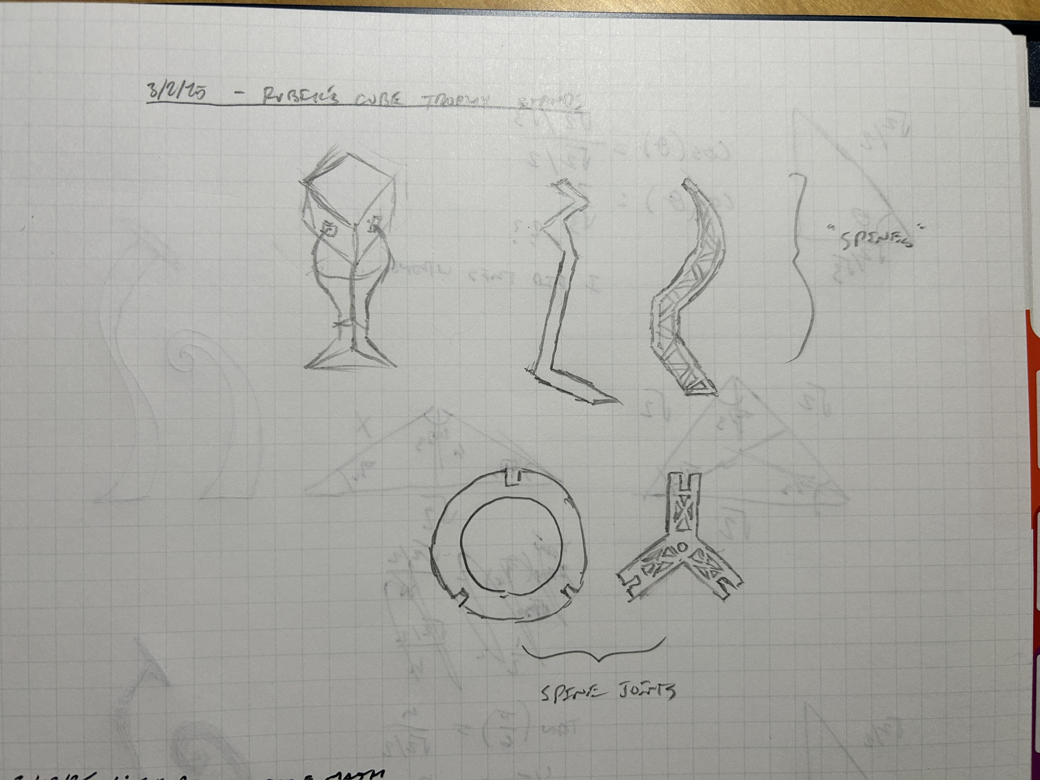
Here are some preliminary sketches of what I was thinking of doing...
3.13.25 - Modeling
The more that I thought about this project, the more I was struggling with what I want it to look like. I definitely want it to have a very specific form and structure, but I'm struggling with moving forward. I figured the best way to proceed was by pushing through and designing one, seeing the results for myself, and moving forward.
The major first step was figuring out what angle the cube's faces made with the plane. I wanted to create these "pads" that make contact with the three faces connected to the resting corner. They would have to be set at an angle such that they are flush to the cube's faces.
Here is the super unorganized math I did to figure out what that angle is:
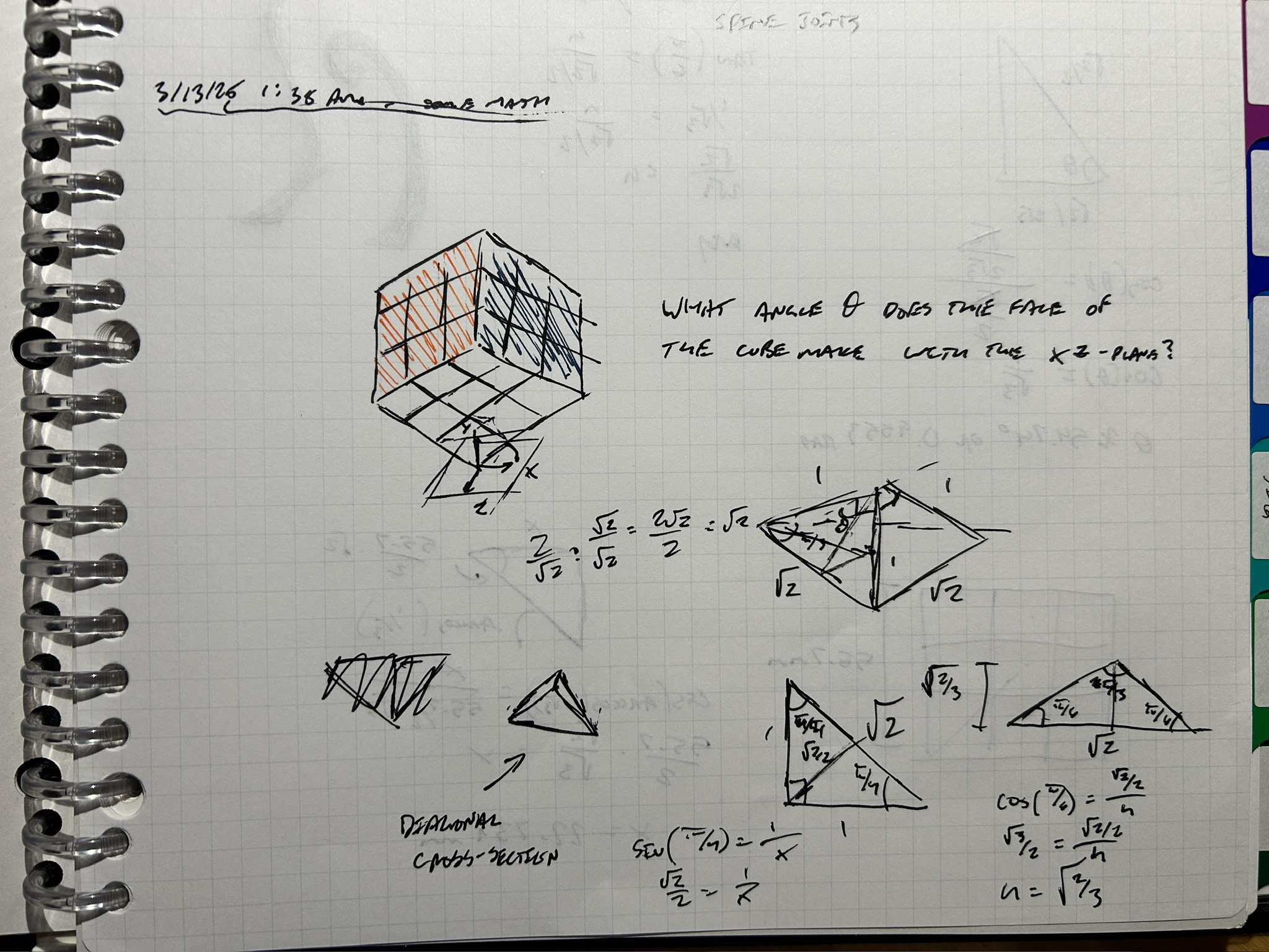
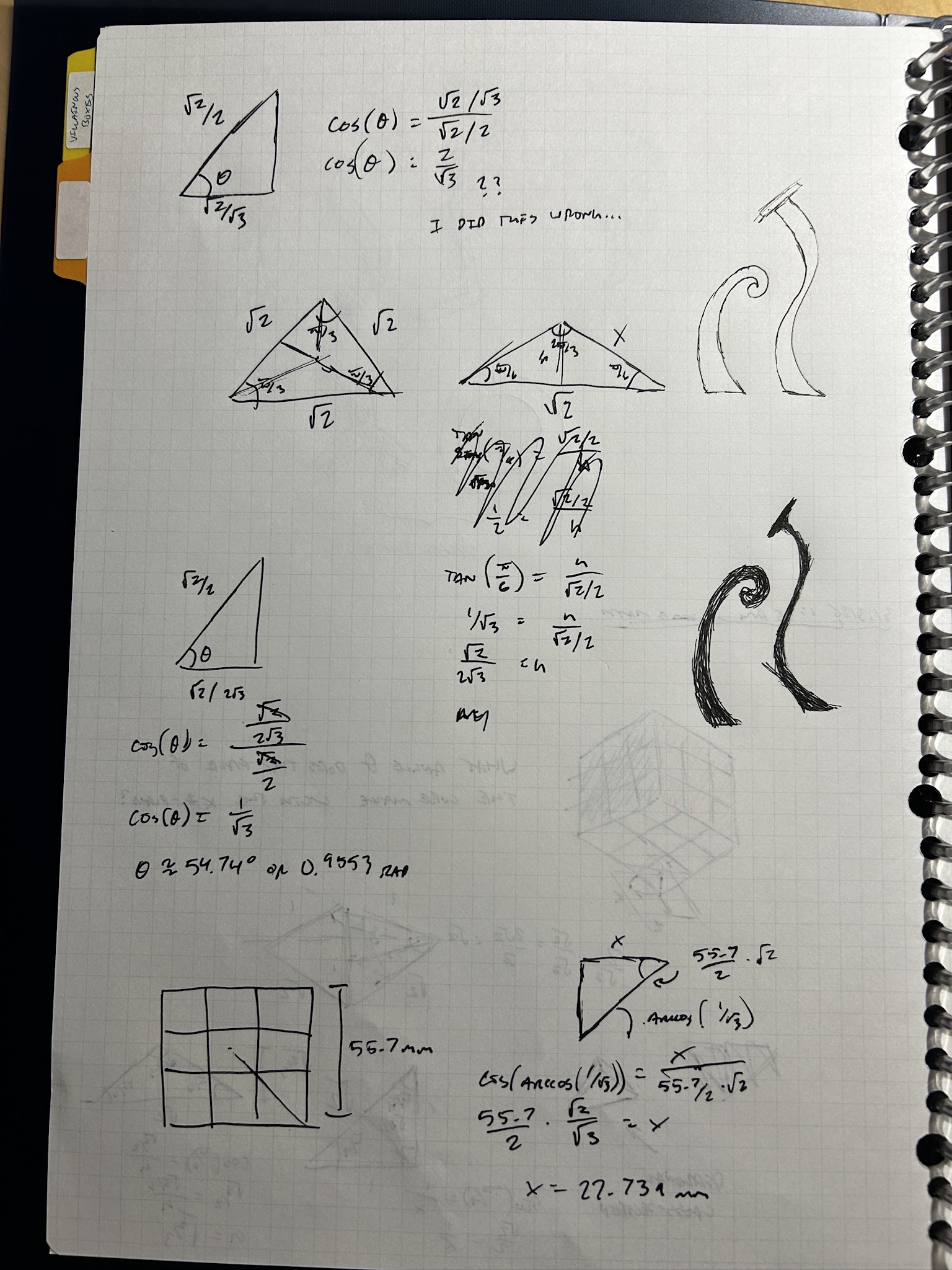
I'm so disappointed that this resulting number is so ugly. I thought it was gonna be a sensible 45°, or perhaps even a marvelous 60°, or something nice and pretty but NO. 54.74°. cos⁻¹(1/√3) if you're nasty.
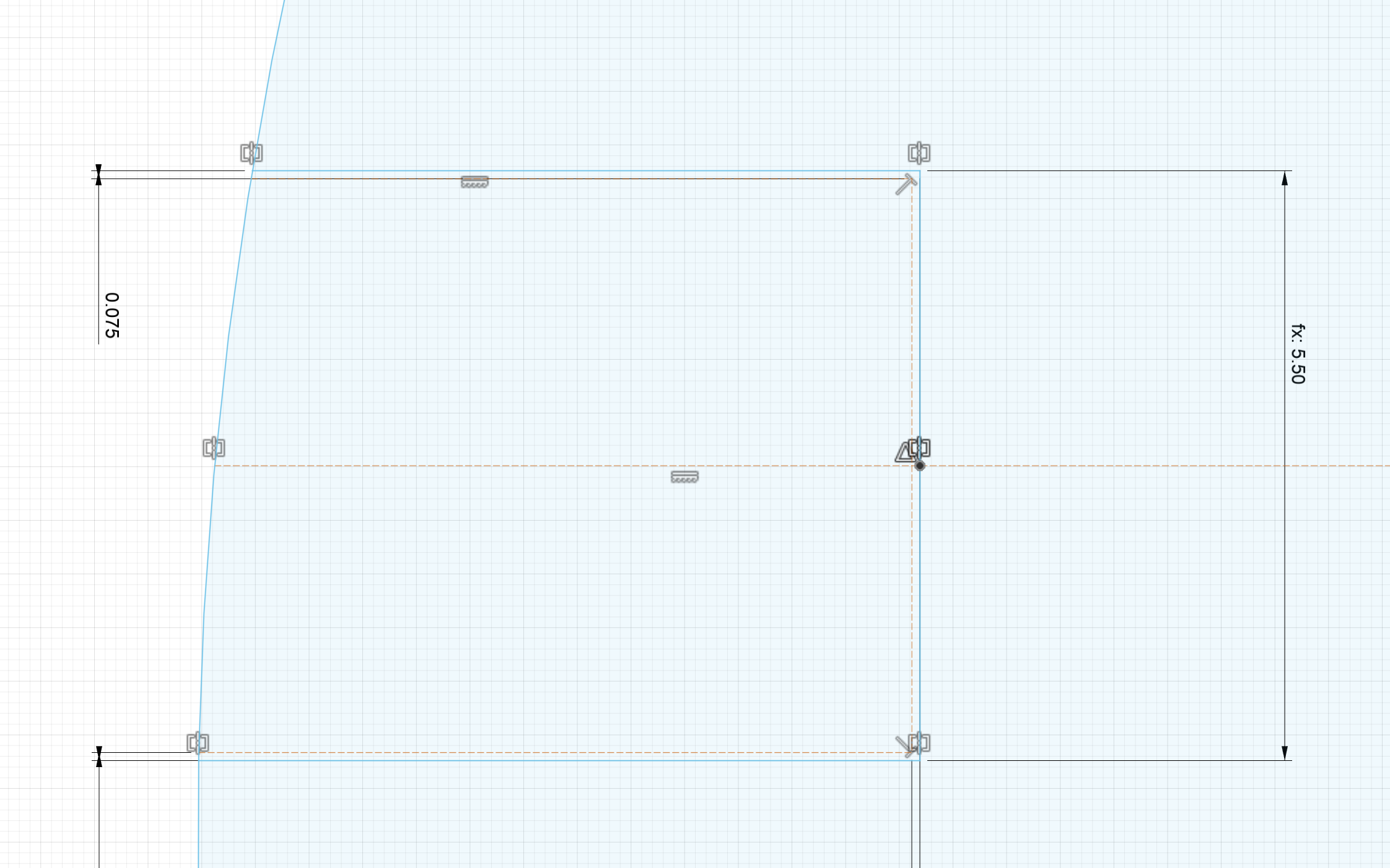
Anyways, I went to Fusion 360 to sketch out the sections of the assembly that create the structure's height. I'm referring to them as "spines." Sure enough, after drawing it out, that angle seems to be correct. The construction lines at the top of the sketch shown below resemble the diagonal of one of the resting corner's faces and the corresponding edge that traces to the opposite corner.
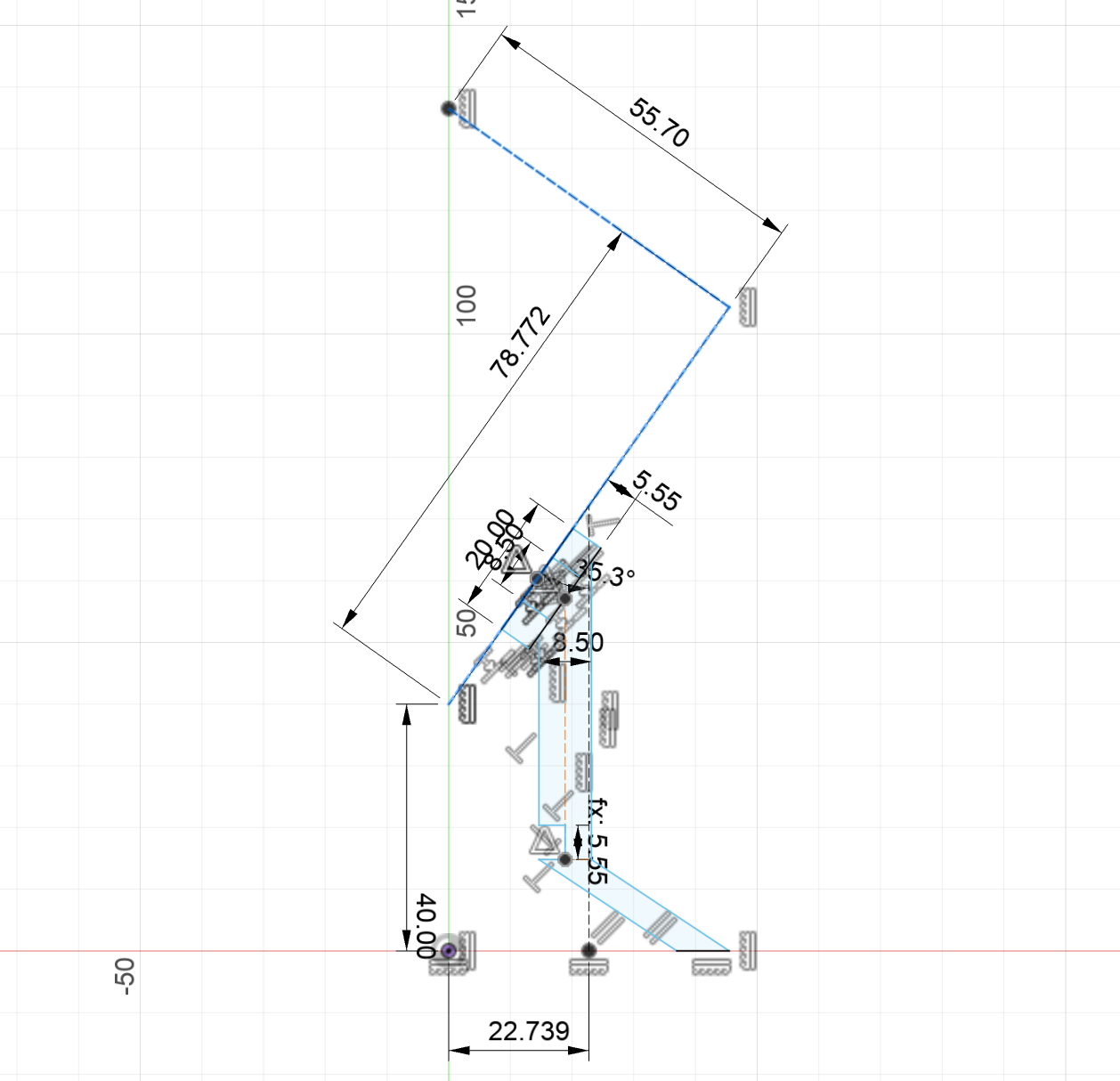
After extruding this out, I created the pads and the joint that joins everything together. All constructions were determined with respect to my material's thickness of ~5.55 mm. I THINK I designed this such that it will reconstruct if the thickness is re-adjusted.
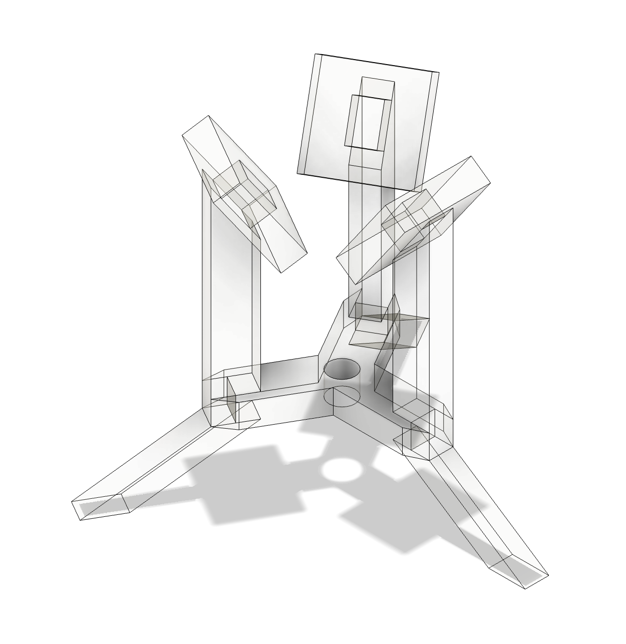
I then created new sketches on each part's face, projected the geometry, and exported them as DXF files. Here are the results:
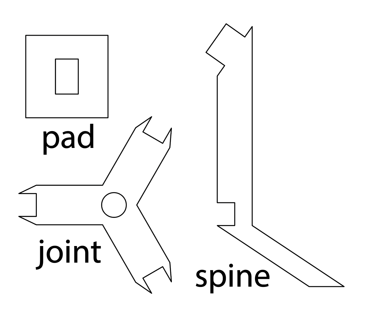
The plan is to take these to the laser cutter at Asmbly and cut them out and assemble them with glue.
3.15.25 - Cutting / Assembly
I cut out the pieces on the Dorian laser at Asmbly earlier today. The results turned out great!
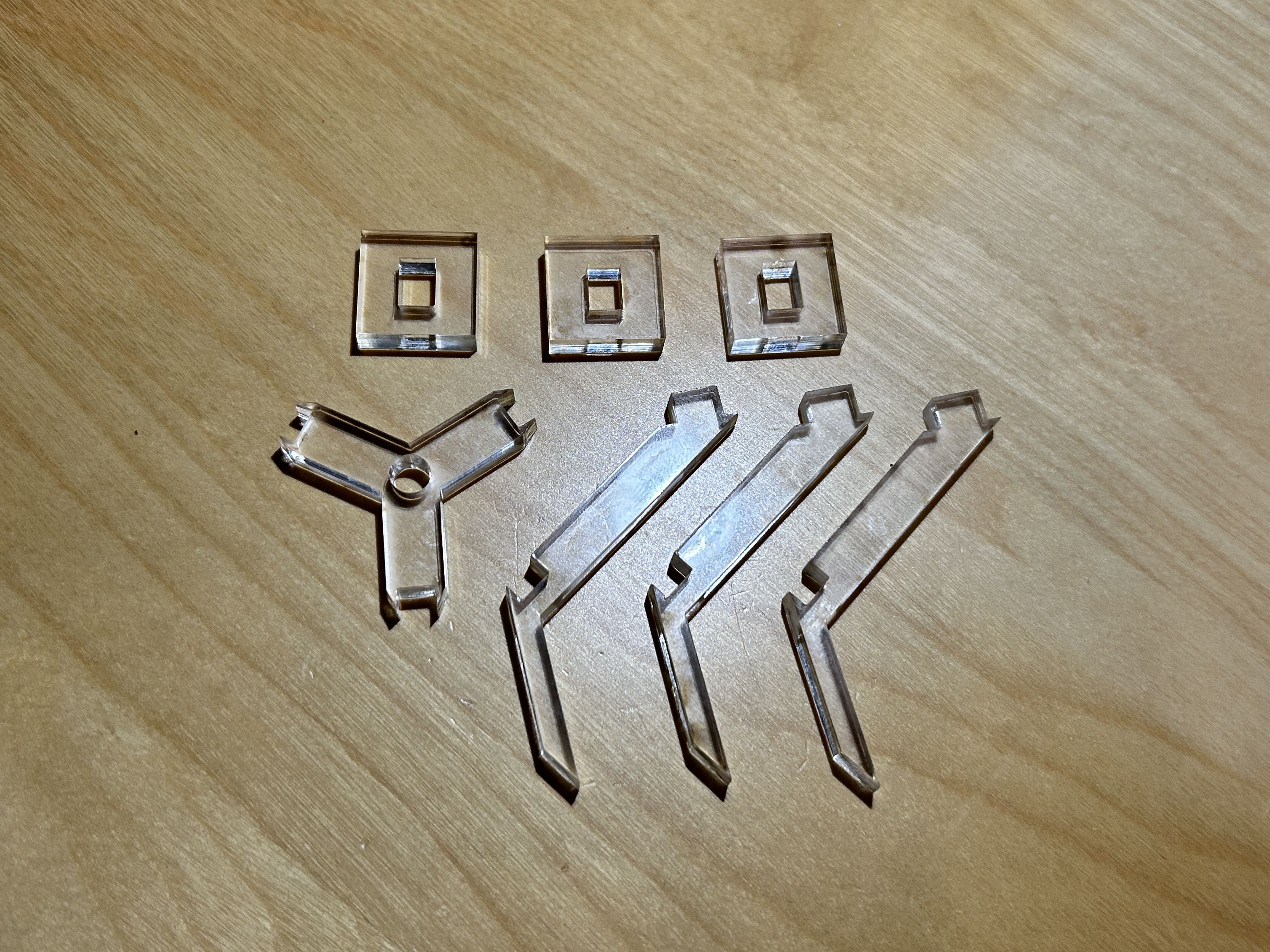
During my first pass, one of the stewards, Danny Miller, swung by and gave me some great advice. First, in lightburn, the best layers to use for tracing the outline of a piece of material are T1 and T2. These are tool layers and will never show up in the cut. They work really well for setting the origin of the piece.
Second, he had really great advice for protecting the acrylic from the laser and getting the best finish. He recommended peeling off the paper on only one side of the material. Otherwise, the layer will flash back into the material when it hits the honeycomb and leave marks.
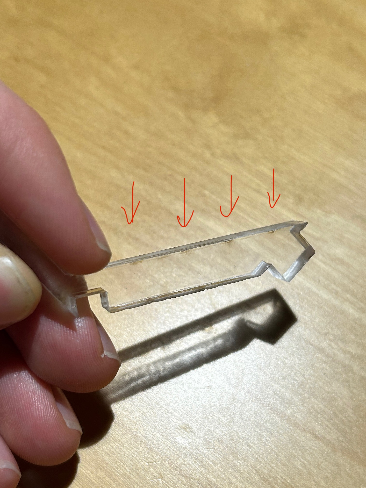
The paper on the bottom diffuses the laser and leaves a better finish. As for the top, a thin layer of dish soap applied to the top with my fingers did the trick. On my second cut, the pieces looked much nicer.
I assembled the pieces together first with E6000 glue which was NOT the move, so I then switched to super glue. The results turned out alright!
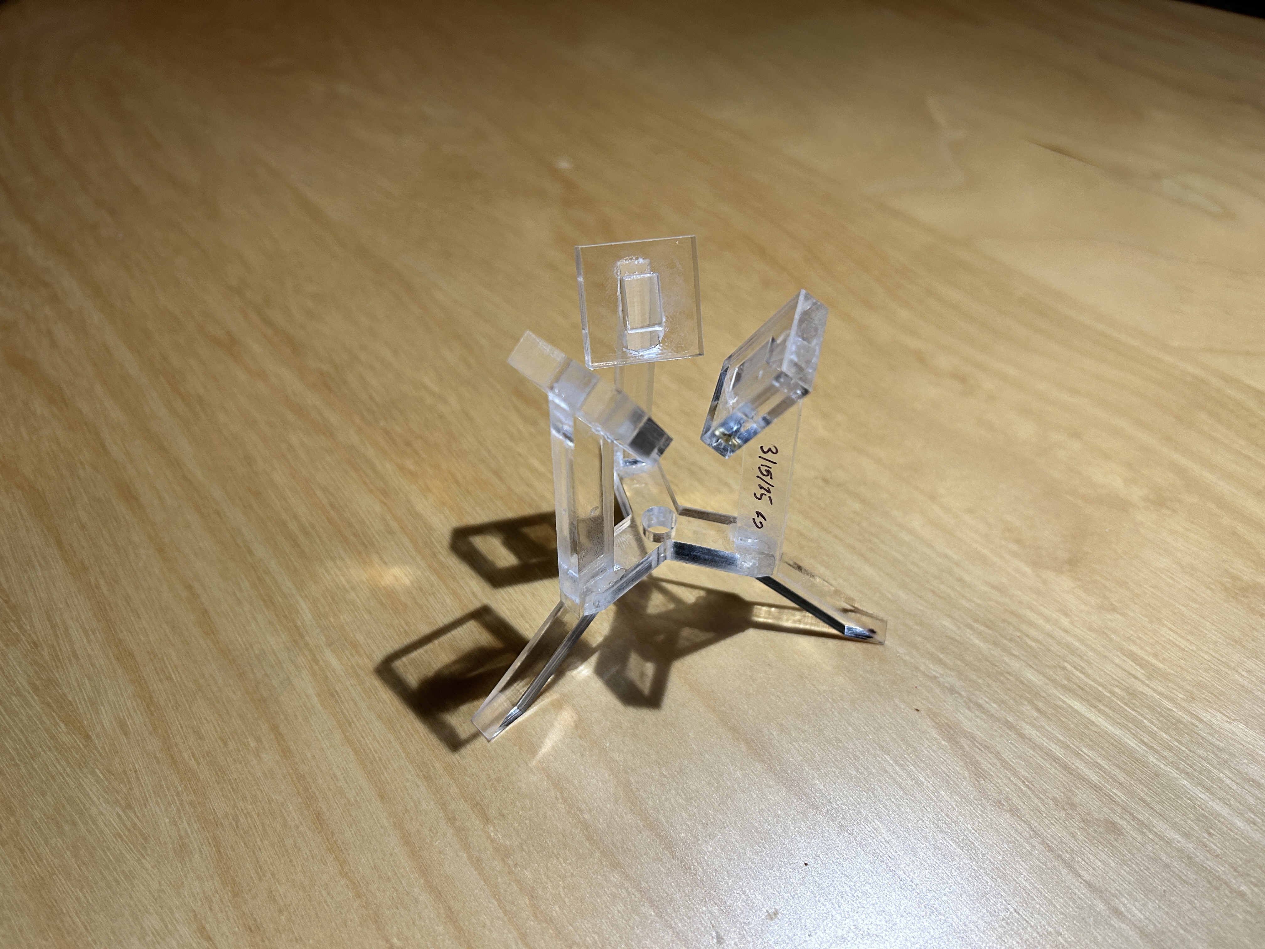
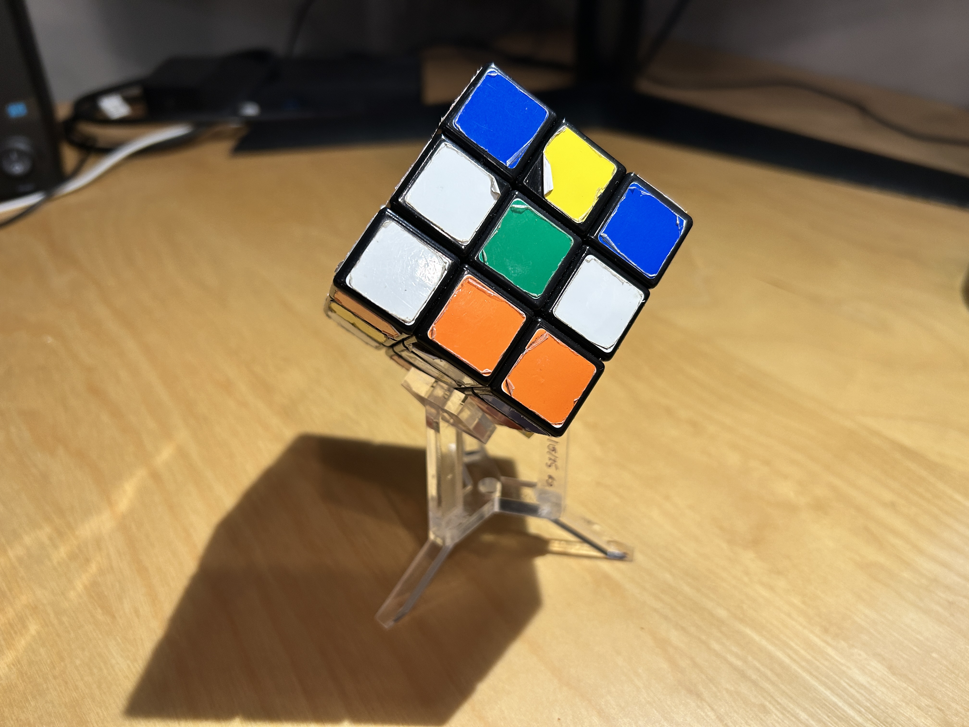
After assembly, I have a few thoughts on how I should proceed:
- The tolerances between the pieces are a little bit wiggly. As a result, the fit isn't the most ideal. The feet aren't the most level with the surface of my table, and the pads aren't the most flush with the cube's faces. I could fix this in two ways:
- Tighten the tolerances with some testing and figure out how to standardize them with all parts in Fusion 360
- Design the stand such that the fit of the pieces isn't crucial. In the original design, the cube sits in an equilateral triangle
- The glue is visible after it dries. Danny suggested using acrylics glue or acrylics dissolved in some kind of solvent to bond the pieces together
- The pads, should they remain a design feature, should probably match the shape of the cube. The pads for this design should be rotated 45°.
- The design should be a bit taller and have more form. Would it look better with bigger cubes?
I really like these shapes as a concept for the next design, maybe I'll give it a shot?
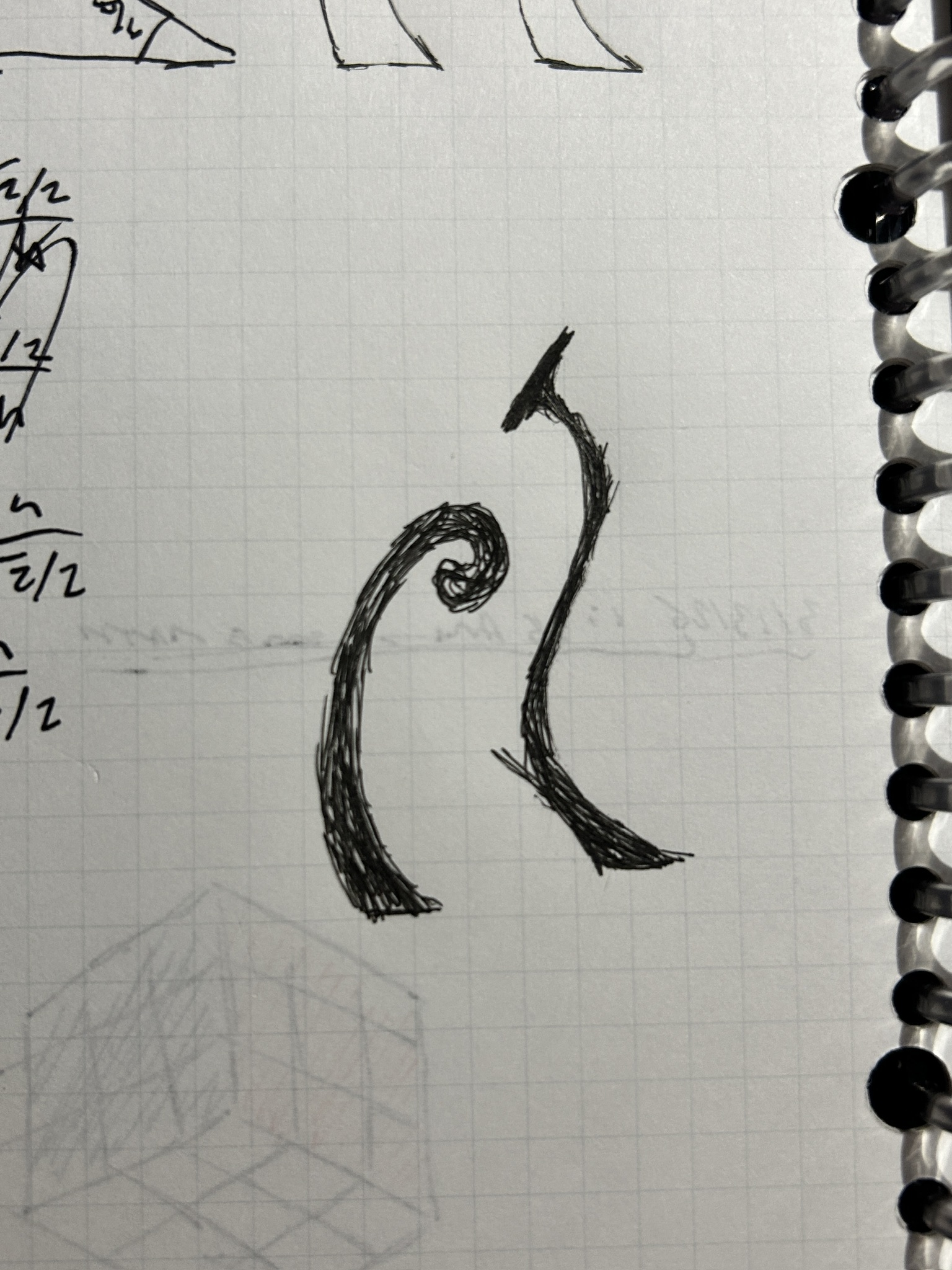
3.17.25 - A Much Fancier Rendition
So, I gave it a shot.
Here is the design of version 2 of the cube stand:
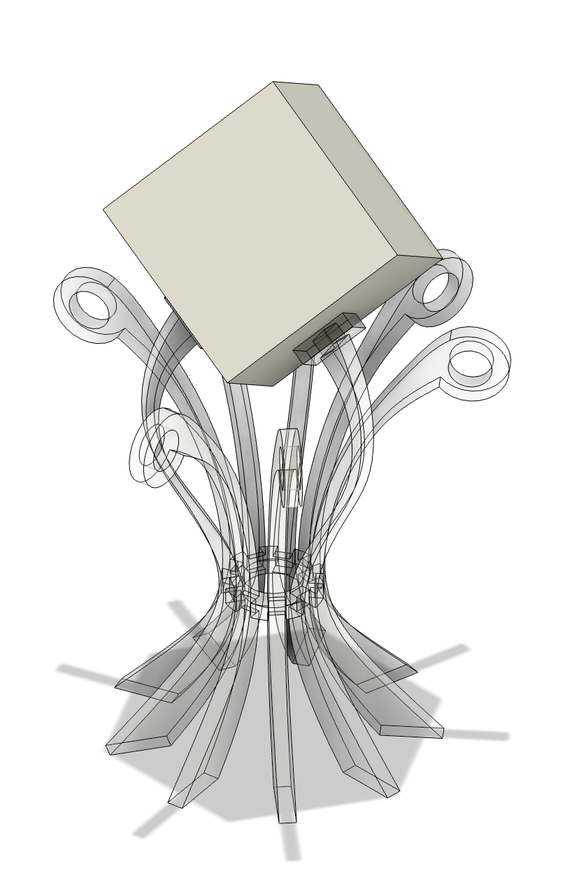
For this design, I modeled the cube itself first, which has the same size as my 7x7x7. Then, in the first sketch, I constrained the pad notch to fit flush to the cube's surface. The rest of the modeling for the curves was done free-hand with the Fit Point Spline sketch tool. The curves were mirrored and adjusted for the decorative pieces.
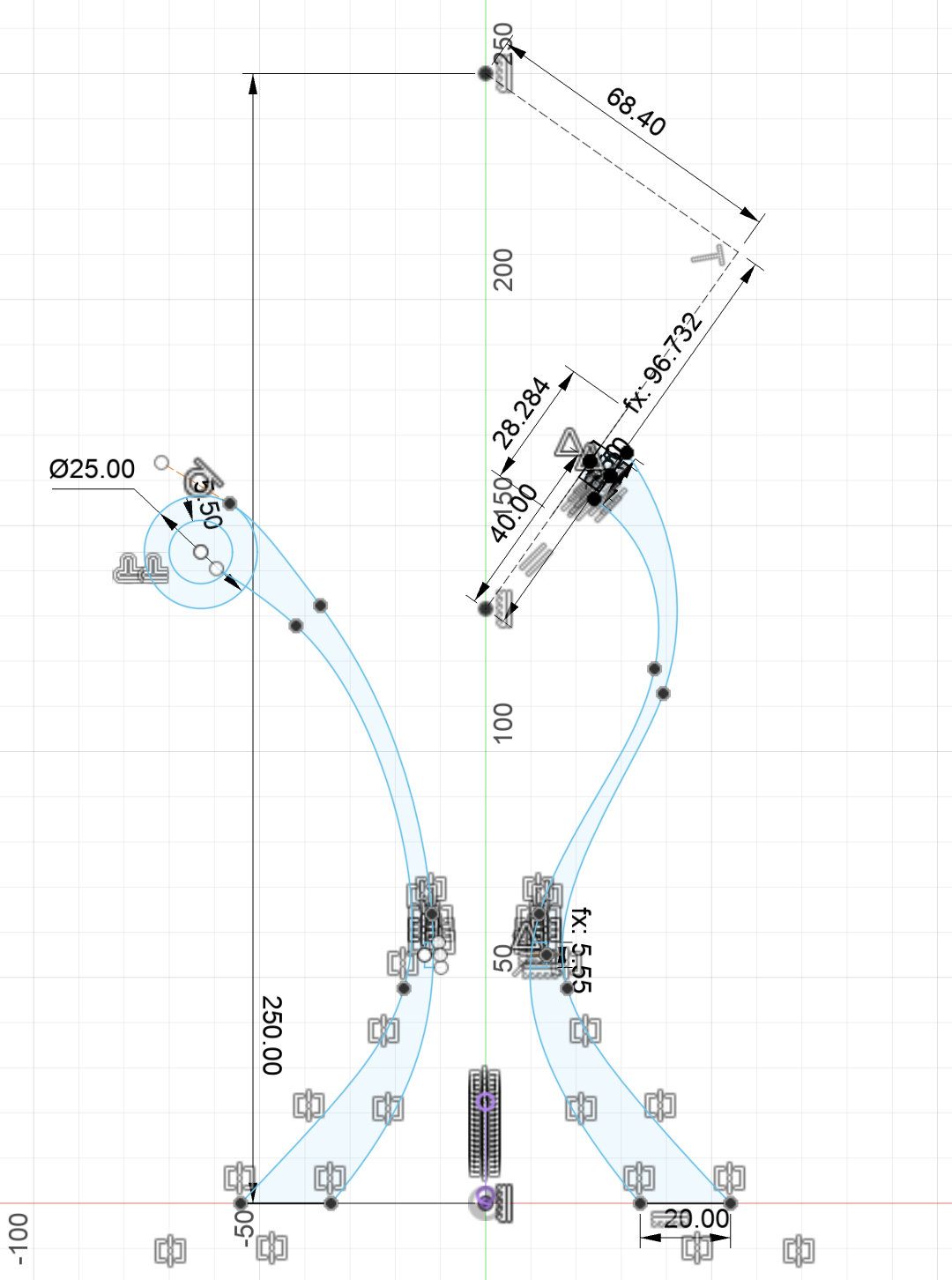
I extruded, moved, and repeated the pieces via circular pattern to create the assembly. The pads were also added to the support pieces. The pads were made to be diamonds this time to match the cube's profile.
Then, I created a sketch on the lower face of the notch for the ring joint, projected all of the necessary geometry, and extruded it. The design was complete. All I had left to do was create the dxf files. Just like last time, I created a sketch on each relevant face of the pieces and projected only the geometry that I wanted cut.
One of the things I wanted to improve on from the last cut was better tolerances. I wanted the pieces to fit together pretty seamlessly. I created offset curves in the notches of each piece to easily adjust the tolerance, but to find out what tolerance I should aim for, I decided to do a series of tests on a piece of scrap acrylic to find the best measurement for both kinds of connecting pieces.
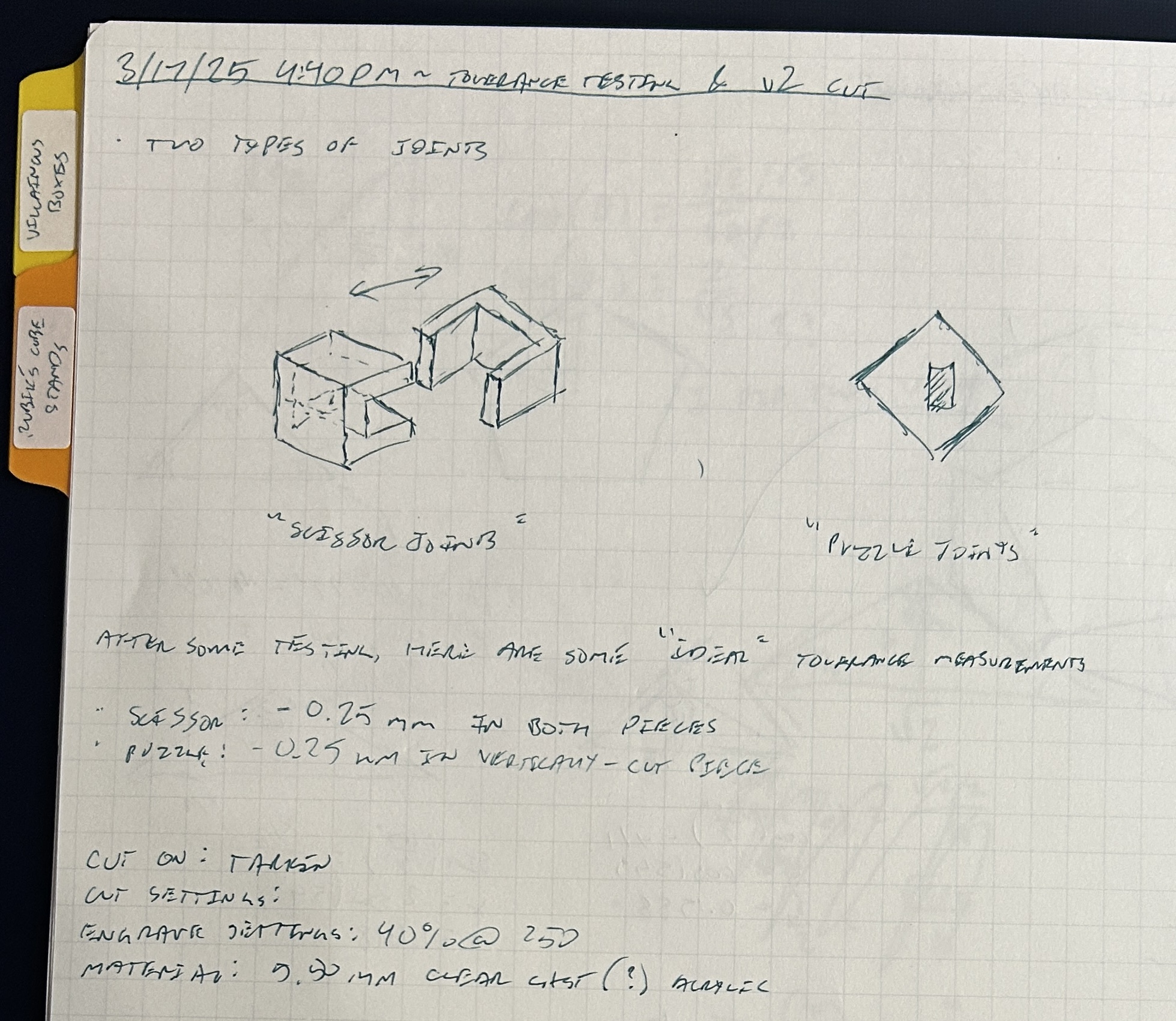
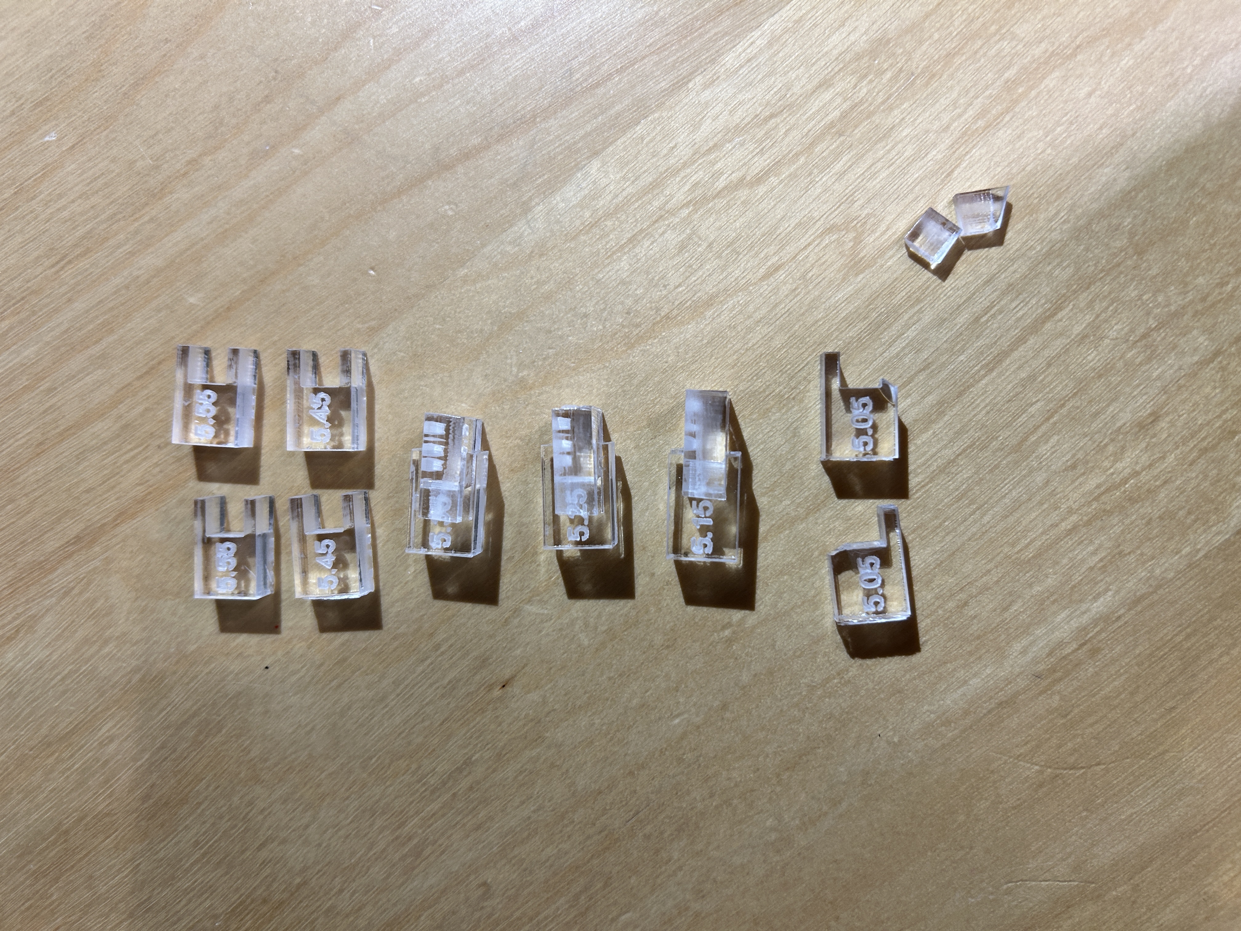
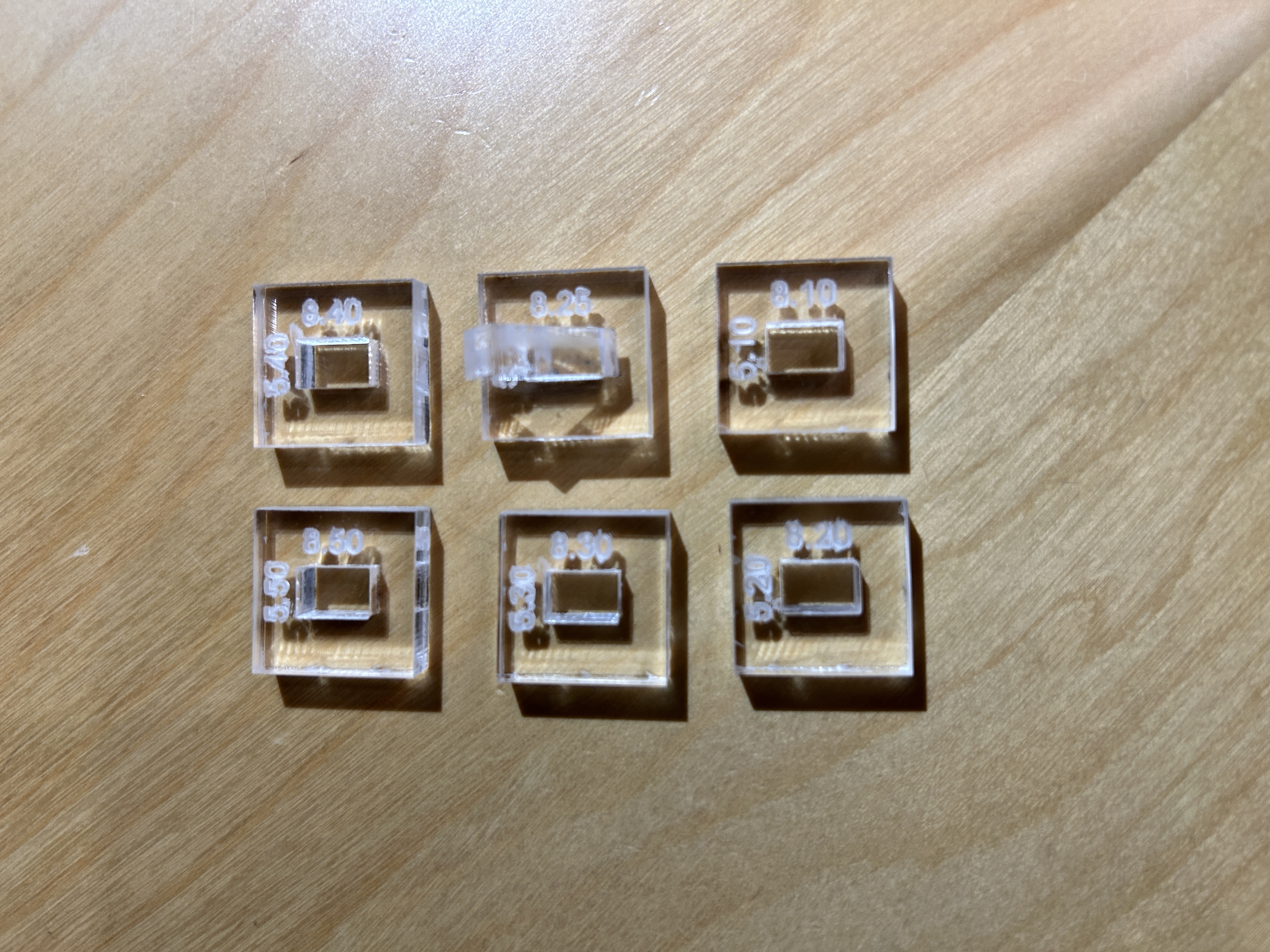
I settled on -0.25mm for the notches for the final cut since it was the tightest fit without being overkill, according to my tests. This means that if the pieces are modeled to fit flush to one another, the notch width should be decreased by 0.25mm, or 0.25mm / 2 on each side. I adjusted the files accordingly and exported the dxfs, brought them into Lightburn, and prepared them to cut!
It was at this point that I realized that something was horribly wrong with my files. For some reason, the curves in all dxf files had duplicated and split into small line segments. I tried my best to clean these up by grouping the lines that were supposed to stay and trimming the rest. It wasn't really working. My greatest concern was that the laser would try to cut over those curves more than once, which wouldn't really damage anything, but it was unnecessary.
After trying my best to clean the files with no success, I resorted to crossing my fingers, starting the cut, and hoping for the best. After all, my material was just $3 and I could easily acquire more.
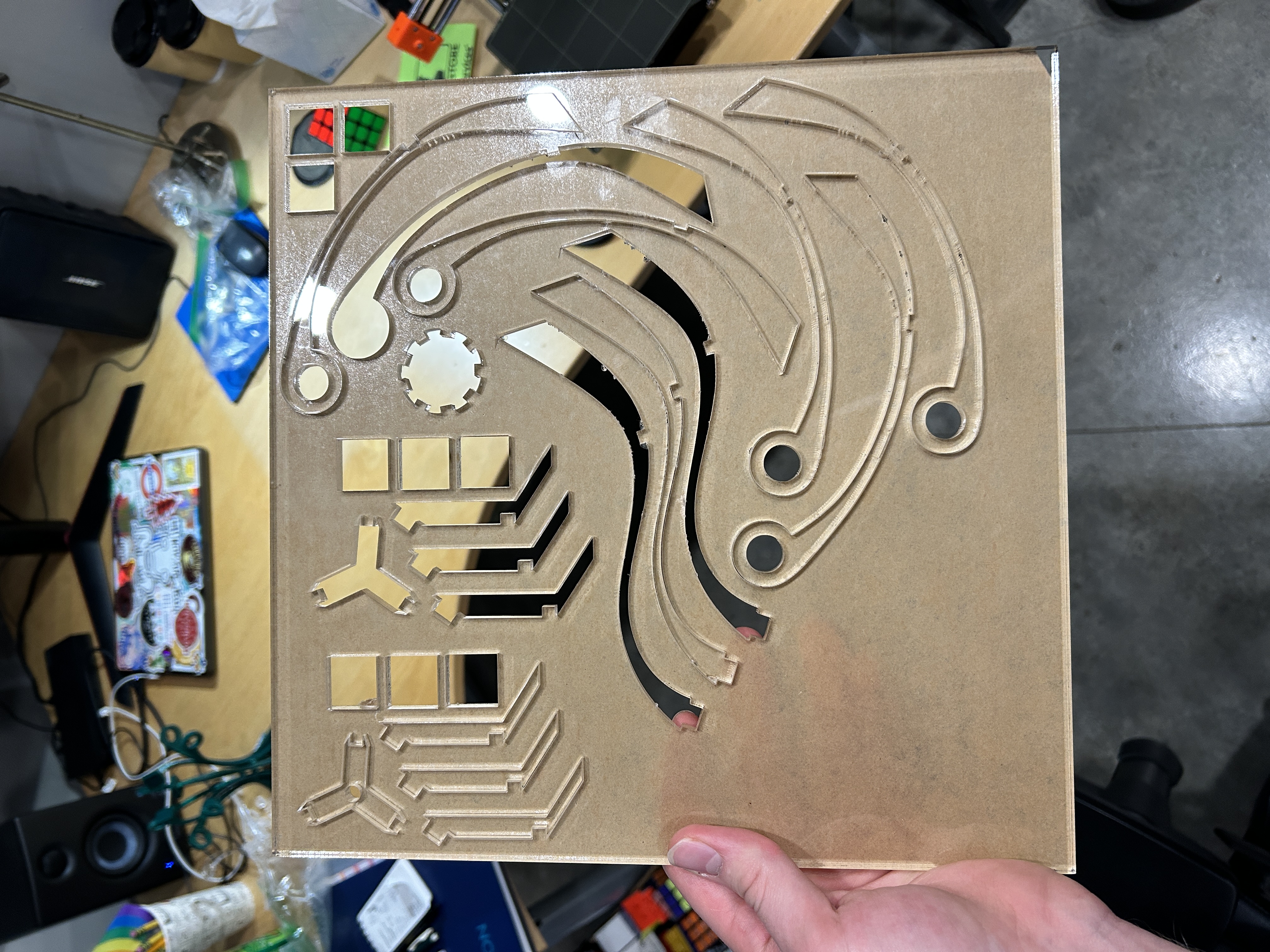
The results were anything but "the best." The laser just cut the line segments without connecting them, meaning the pieces couldn't even be removed from the acrylic, unless I popped them out with a lot of force. The ones that popped out either cracked or popped out with sharp pieces of excess acrylic around the edges.
Luckily, I was able to pop out the four unique parts and put them together, only to realize that the tolerances were still too tight, and the notches on the ring joint were a bit shallow. I also cut my fingers a few times. Acrylic is sharp!
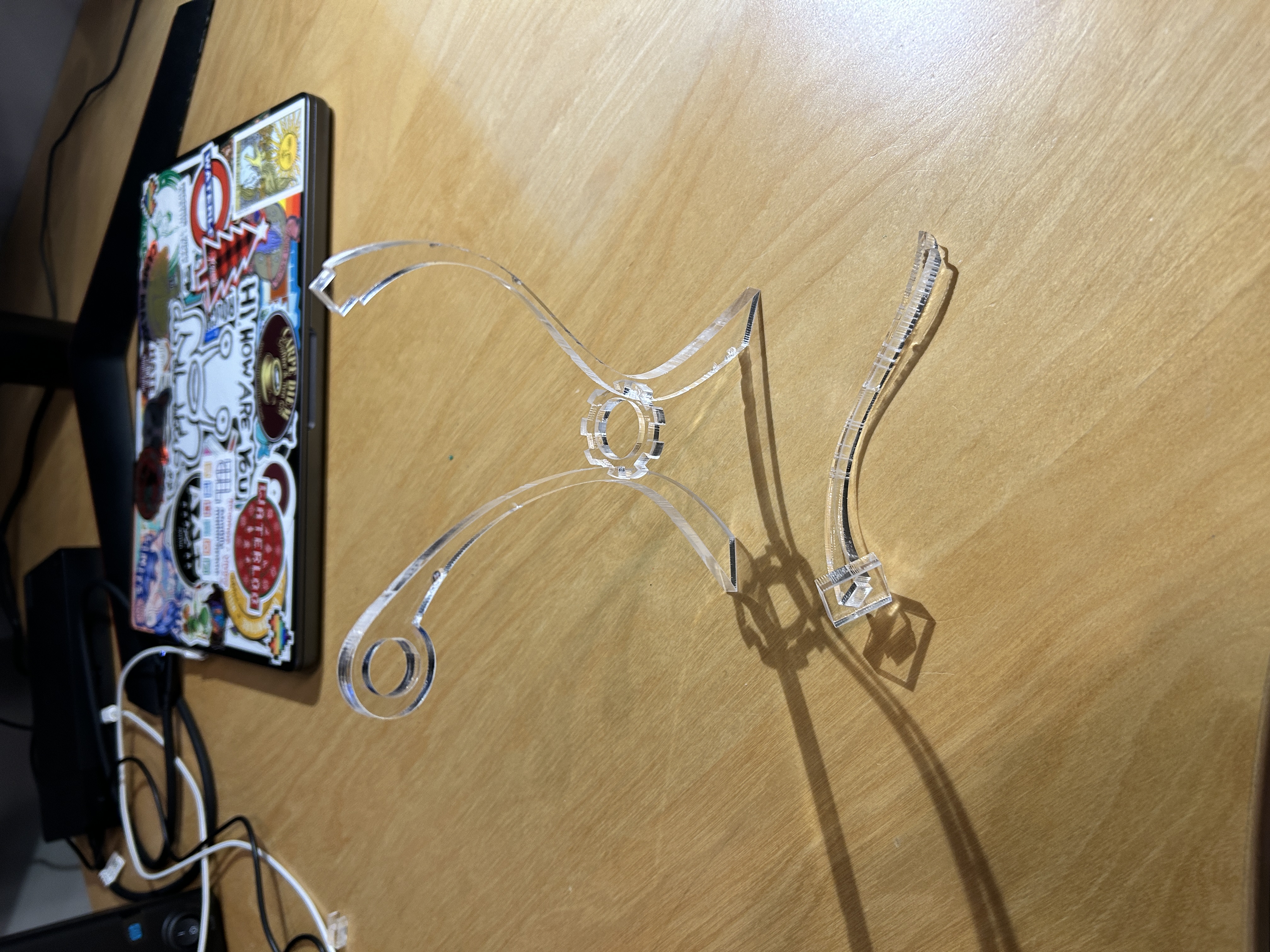
Overall, this cut was a complete failure, but I learned a lot. After reflecting on it, I suspected that the sketch splines were complicated enough to confuse the "Project" tool in Fusion. My guess is somehow, when I projected the curves into a new sketch, it copied the geometry incorrectly and split it into a bunch of line segments. It wasn't an issue with the last design version since all of the lines were straight.
Since I was bored and had an idle 3D printer, I decided to print out the model to check the fit, size, and design.
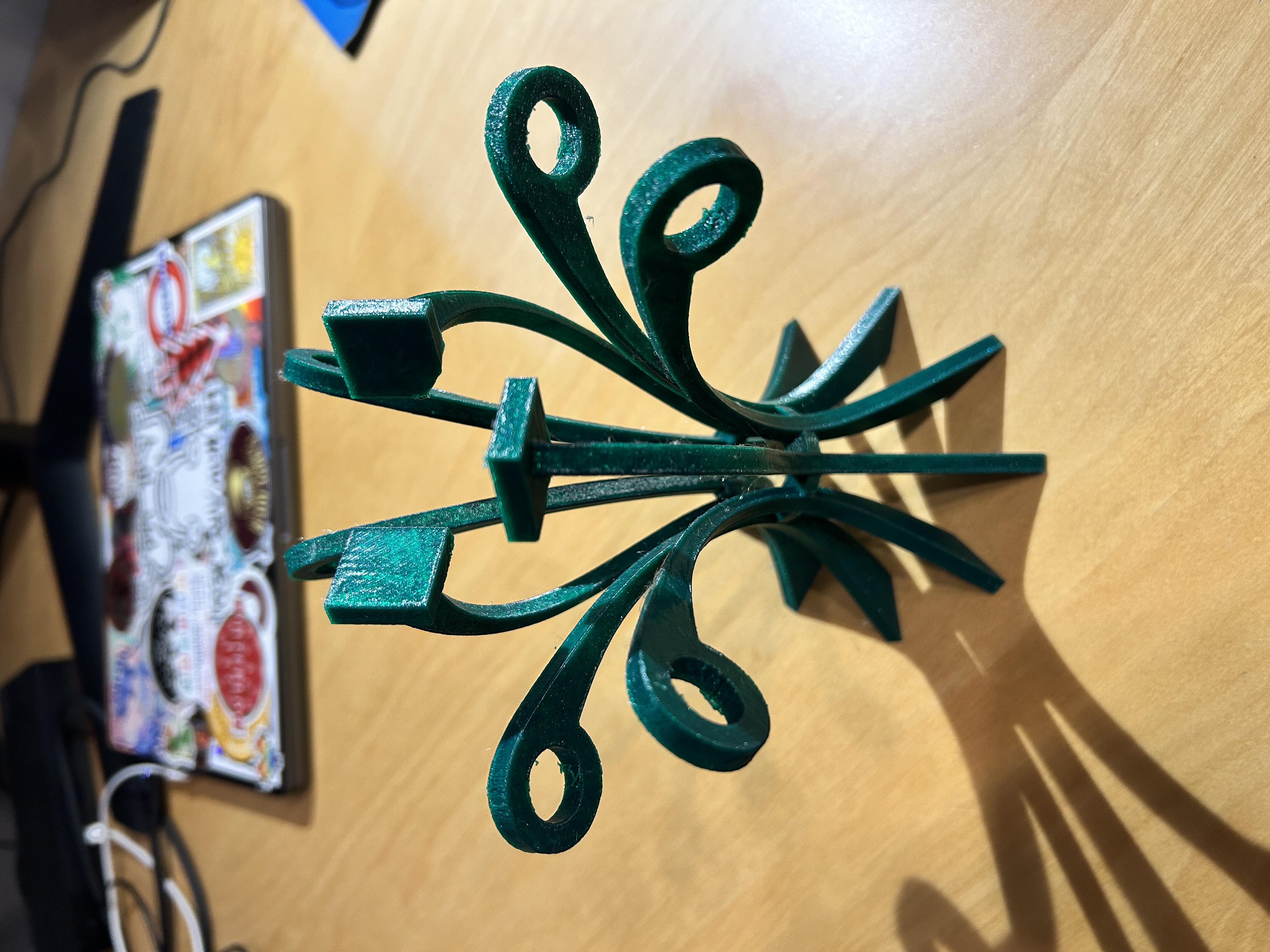
Unlike the final product, the 3D print is not made of solid plastic, but the support curves were flexing a LOT. It didn't seem like it would support the weight of the cube at all. A design change would need to be made.
So here are the improvements that I would like to make for version 2
- Make the spines wider. This will fix two issues: bending under the weight of the cube and shallow notches in the ring joint.
- Add a spoke joint at the top of the model to make the support curves more rigid.
- Fix the dxf files. I have to find some kind of way to process the files with the offset notches WITHOUT projecting the geometry in Fusion.
- Change the tolerance from -0.25mm to -0.15mm and hope that the fit is much better. The fit was pretty good in the testing I did.
I think I shall name this model Dolores.
3.22.25 - Dolores v2
I went back to Fusion 360 and made all of the design modifications. Here is what the new sketch looks like:
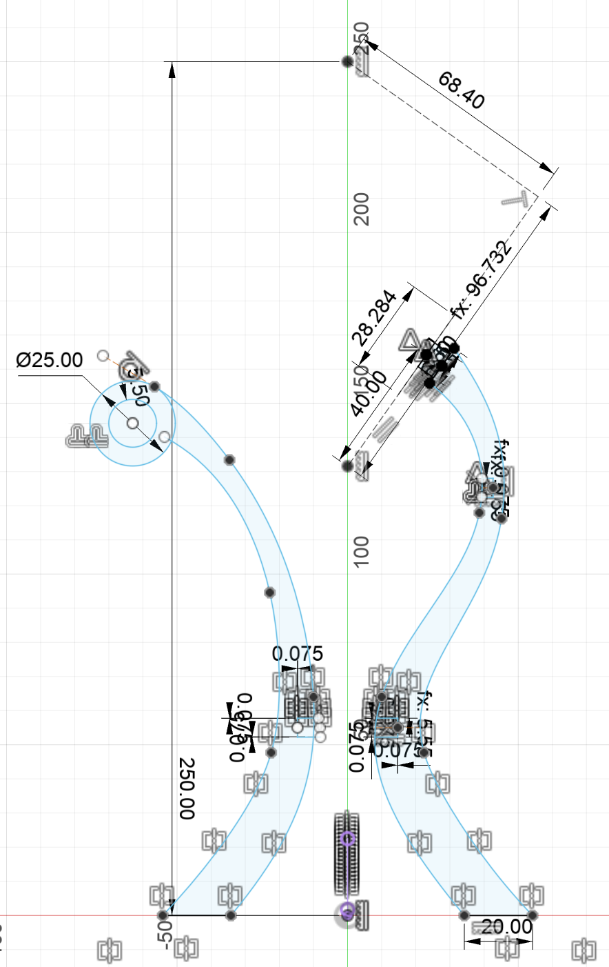
I decided to make the tolerance-adjusted notches in the original sketch instead of a sketch with projected geometry to circumvent the line segment issue.
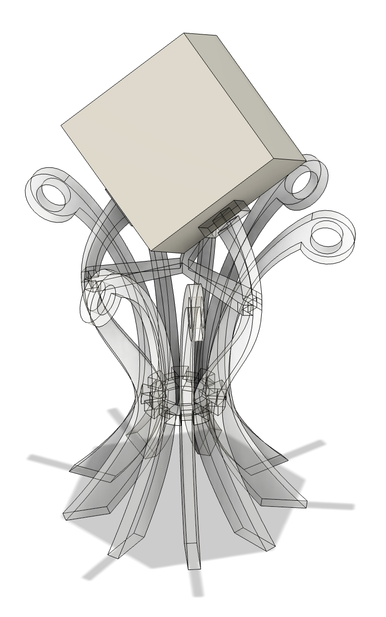
This is how the final model looks. Notice the new joint near the top:
I used Illustrator to process the DXF files individually, which took a bit of time and practice to pull off. I extended lines and used Pathfinder to divide the lines where I needed to divide them as a means of replacing the original notch with the tolerance-adjusted notch. I also had to remove all of the unnecessary construction lines and details that I did not want to be cut.
The cut for these pieces went MUCH smoother, and the fit turned out great! Here's what it looked like once it was assembled:
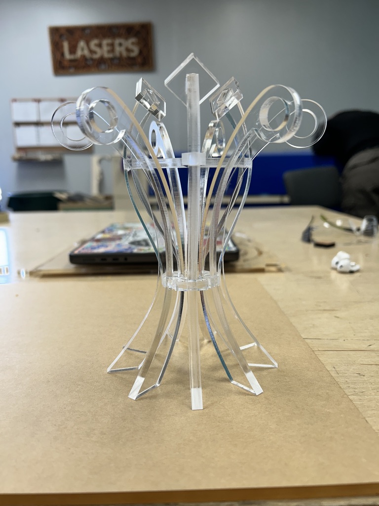
Even though the tolerance was much better, I still used a bit of superglue to hold the pieces together, since some of them were still just a tad loose. Again, the glue is visible, but I managed to glue it in a way that made it difficult to notice. For the next design, I might adjust the tolerance even further. (Side note: someone recommended to me that I refer to the laser kerf, or the supposed "thickness" of the laser, to adjust my tolerances, but seeing as the kerf was 0.25mm, I didn't see any relation between the tolerances that worked best for me. Maybe it's important if I work across both machines... I believe Tarkin's kerf is larger than Dorian's)
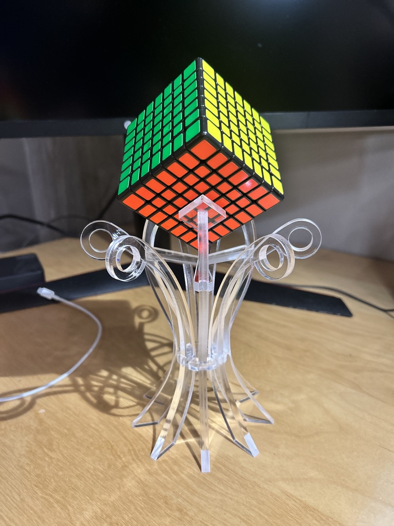
Now that the tolerance is tighter, the fit of the cube is flush with the angled pads. I am very proud of how this turned out!
I could keep making modifications to this model if I REALLY wanted to, but to be honest, I think I'm pretty content with where this model has ended up. I'd like to do another for my Gigaminx, something with a thin profile, wide trumpeted brim at the bottom, and "porcupine spines" to give the model some form. This involves playing with the following:
- Material thickness: could I make a nice-looking model that uses different thicknesses?
- Color: clear is boring, what else is there?
- Fit: Can I design this to fit without the need for glue?
I also would like to refine the process of adjusting the notch tolerances in an effortless way. Maybe there's a feature in Lightburn that could help? I don't know too much about how the software works so it could be a good idea to sit down and complete a training on it.
4.6.25 - Edna v1
Ok I designed the model for my Gigaminx.
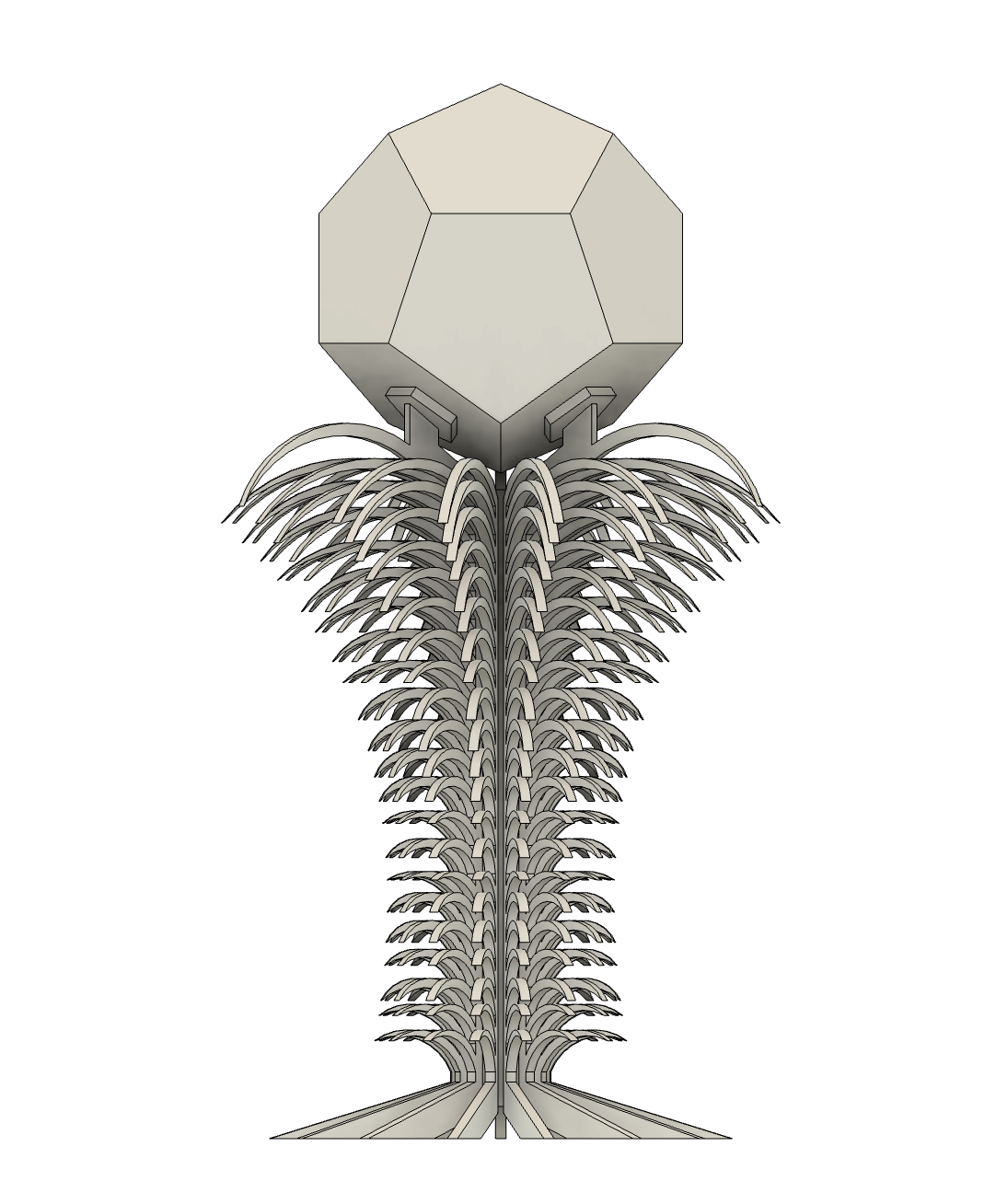
I think this design is super fun. I'll briefly discuss the design process.
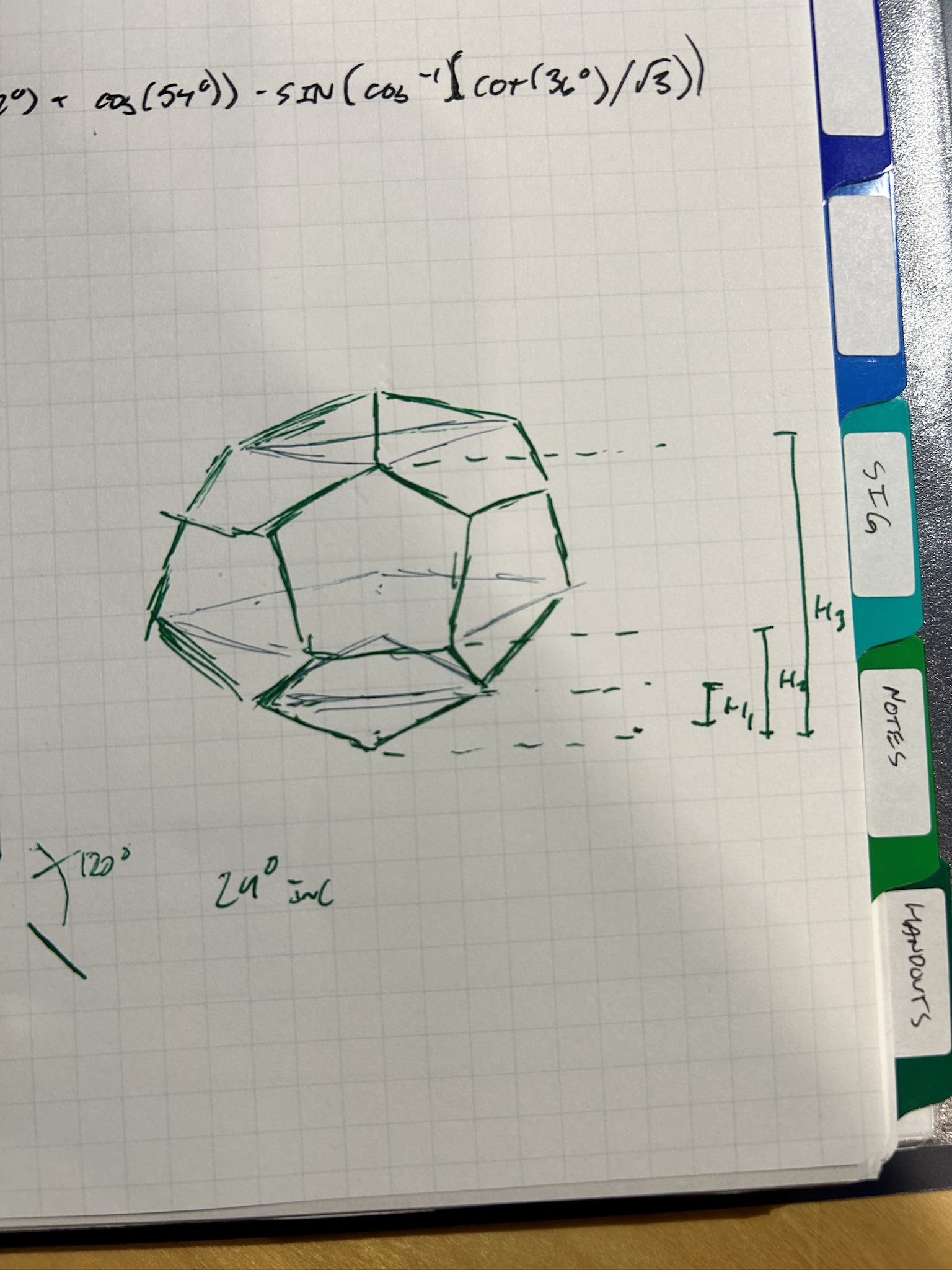
First, because I am who I am, I wanted to take on the challenge of modeling a dodecahedron on its corner in Fusion 360 by myself. This involved doing a LOT of math, mainly a LOT of trigonometry, so I drew a LOT of triangles. Here is my very messy and unintelligible scratch work:
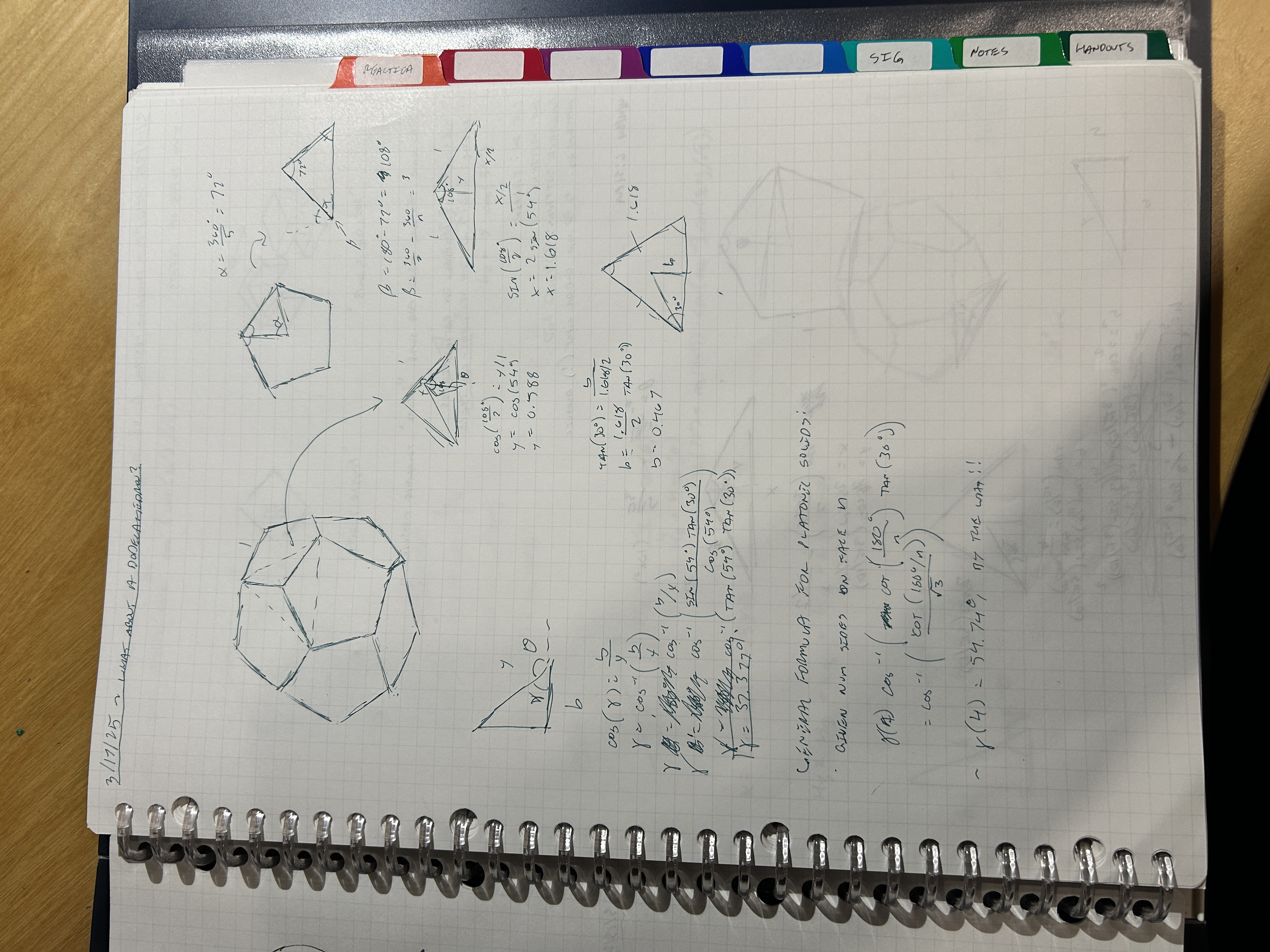
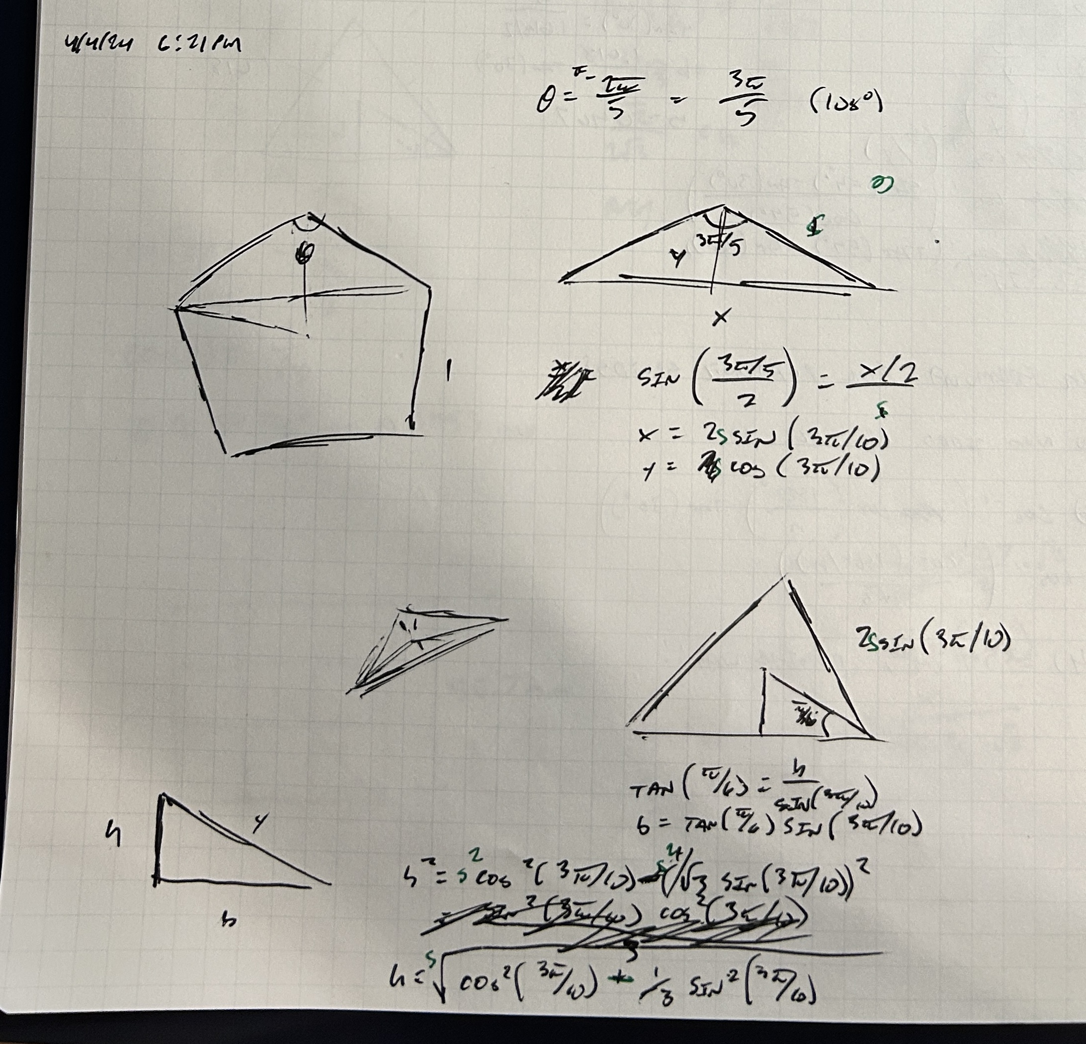
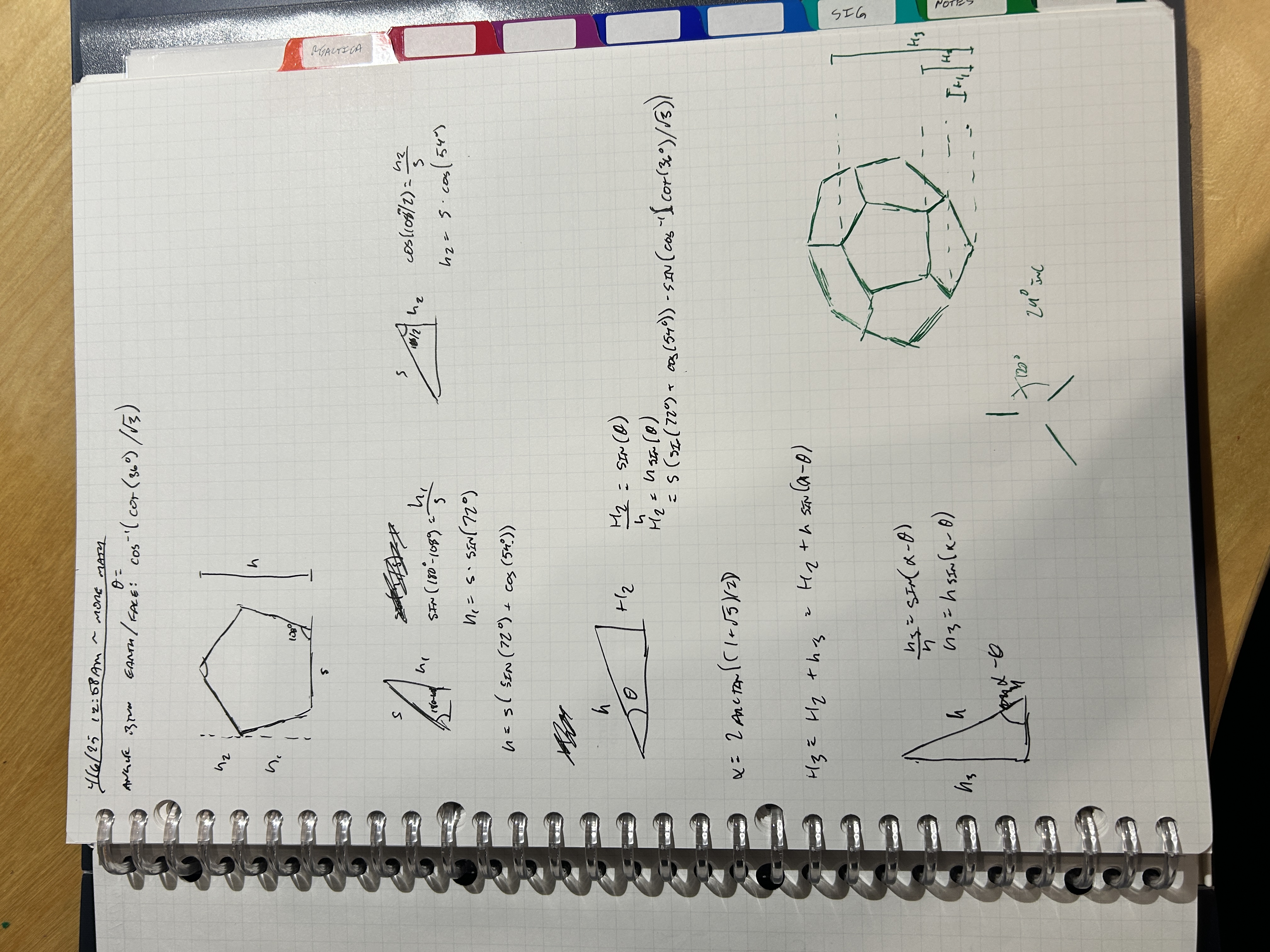
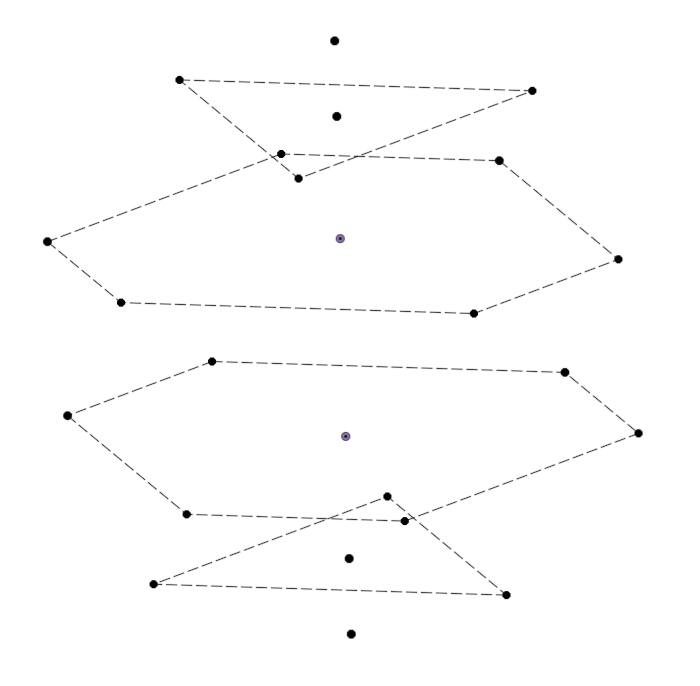
Basically, while I was looking at the model, I found that there were six unique planes parallel to the horizontal that intersected with all of the vertices of the cube. Since it's a platonic solid, it's got some symmetry, so there were only three reference heights I had to compute to model these planes:
After these were created, I needed to draw the profiles on each plane and model the points. I did this by looking at the cube and doing some trig. This is what I ended up with:
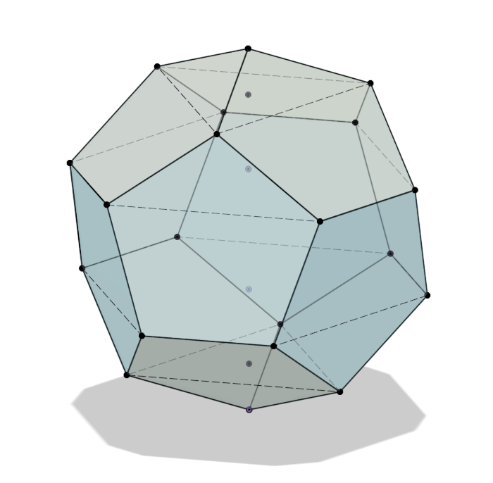
Then, I created a 3D sketch, connecting all the points together. I converted each profile to a patch in the surfaces menu and stitched them together to get my solid. I was very happy with the results! Although, there is probably is a much simpler way to model this solid, especially if you started on one of the faces. I started on the corner since I didn't want to figure out how to rotate the solid properly. I ended up doing a lot more math than I needed to; I still had fun though.
I translated the cube 200mm upwards and got to sketching the profiles. I wanted the base of it to be narrow and for the silhouette to be created via some kind of "illusory" or "delicate" decorative feature. As mentioned in the previous entry, my idea was to use porcupine "spines." I'm referring to these as "feather" to avoid confusion with the aforementioned piece I've labeled as a "spine."
I also wanted to create this using a material of a different color and thickness. I really want the spines to feel delicate and fragile, and I've decided 5.50mm is not a delicate and fragile thickness. We need to go THINNER. And IRIDESCENT. Because it's COOL.
I found this material on Houston Acrylics.
Thus, I designed for 1/8" thickness (or, any thickness you'd like, thanks to Fusion 360 variables and good design practices). After a LOT of constraining and dimensioning and playing around, this is the sketch profile I ended up with.
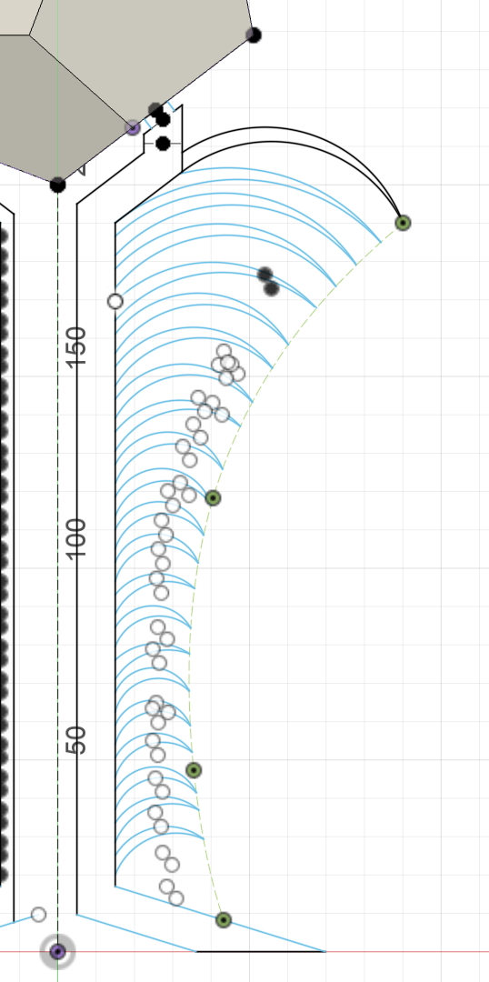
I dimensioned the difference in radius of the feather arcs, the base width, and the spacing, and I constrained the end points to the construction curve I created. The curve should be easy to modify, and I can play around with where the points land if I need to, but I think this looks really cool once it's extruded and duplicated.
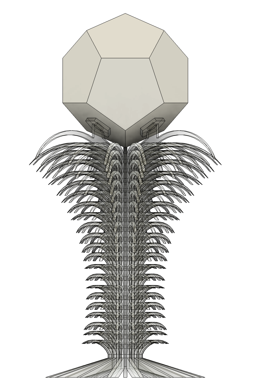
I wanted this silhouette to be very visible, so there are a lot of pieces (fifteen of them). I have yet to create the joints that keep them all together. I also want to play around with the form a LITTLE more. And I think the bottom is kind of ugly. It needs to be more curvaceous and dainty.
Also, this is A LOT of material. I need to be wiser about how I use it, how I test my tolerances, etc. I'd like to refine the process of generating tighter slots as well. Plus, better bonding techniques (if I need it). Also, is 1/8" acrylic strong enough to bear the weight of the cube PLUS my consciousness? Very excited to see what the next phase of this project entails!
4.10.25 - Edna v2
After refining the design just a liiiiitle bit, I think I've arrived to something I like:
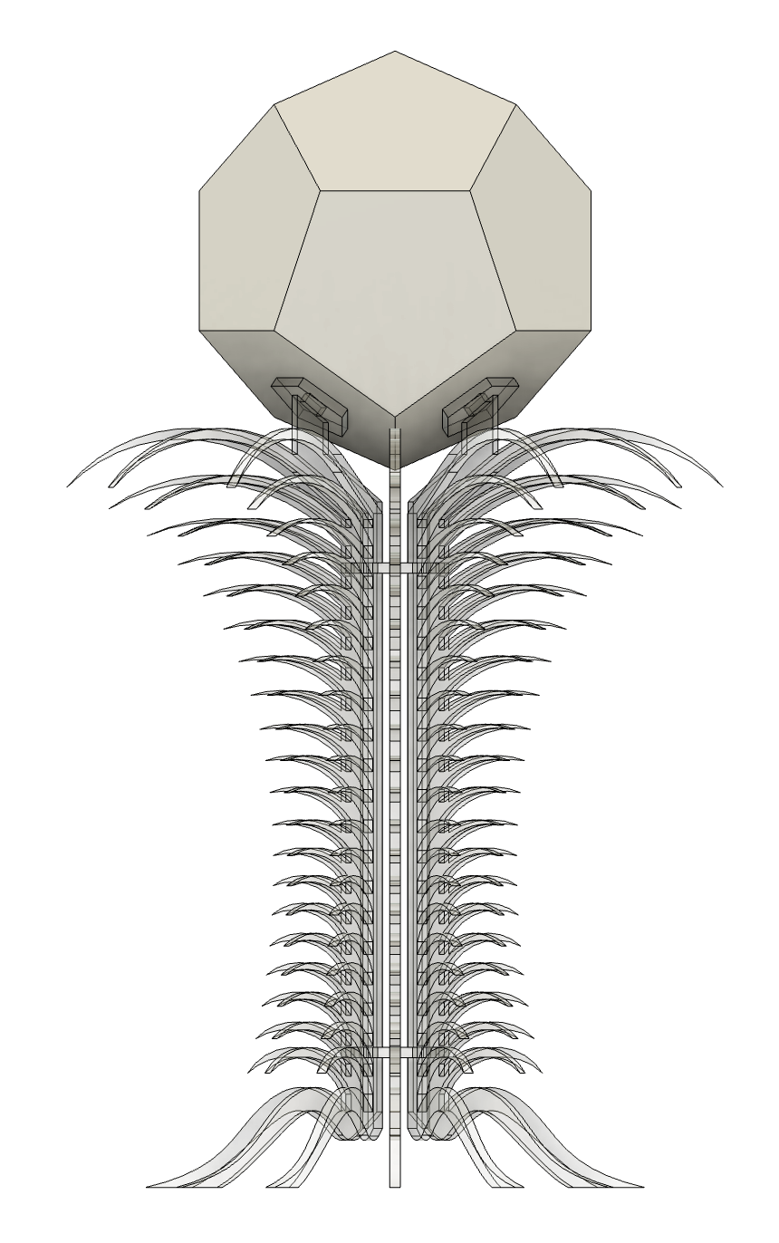
I realized that with all of the dimensioning I did for the feathers, the radii were still out of whack. Some feathers bowed a bit more outward, while others curved more inward. I played around with the radii of these feathers and found something that I think looks really nice. I also altered the silhouette a little bit to tighten the "waist" just a bit, plus the top and bottoms of the silhouette go a bit more outward. Also, I changed the foot design to curve along with the bottom-most feather before bowing outwards. I also created joints to hold everything together. I also changed the material thickness to be 2.95mm instead of 1/8" since that was the measured thickness of the acrylic sheet I bought. I also changed this assembly from 15 pieces to 12 pieces so I don't use as much material. I also changed the notch tolerance from 0.15mm to 0.20mm.
So yeah, lots of minor modifications to v2, which ended up taking a while. But patience is key. I think even with the subtleties, this looks notably better than v1. I also found what I think the best method for modifying notch tolerances is!!
- Create a sketch on each profile that needs to be cut and select the Project Geometry tool. Instead of projecting each line/curve, project the entire FACE. You'll end up getting an outline trace of the face you plan to cut without any extra geometry.
- For each notch, select the notch's walls and use the offset command to shrink the notch profile by
tolerance/2. The notch will now betoleranceless than it was. Then, convert the original lines to construction geometry. Join the points at the end of the tolerance-adjusted notch with the rest of the profile. Proper constraints will allow a filled shape whentoleranceis adjusted. - Export each tolerance-adjusted sketch to DXF. In the export menu, I converted to inches (since it's the default for illustrator), unchecked "Points," and unchecked "Construction Geometry." This gave me a clean DXF with only the cut lines.
I tried this process with Dolores and ended up with much cleaner files.
Also, the material from Houston Acrylics has arrived.
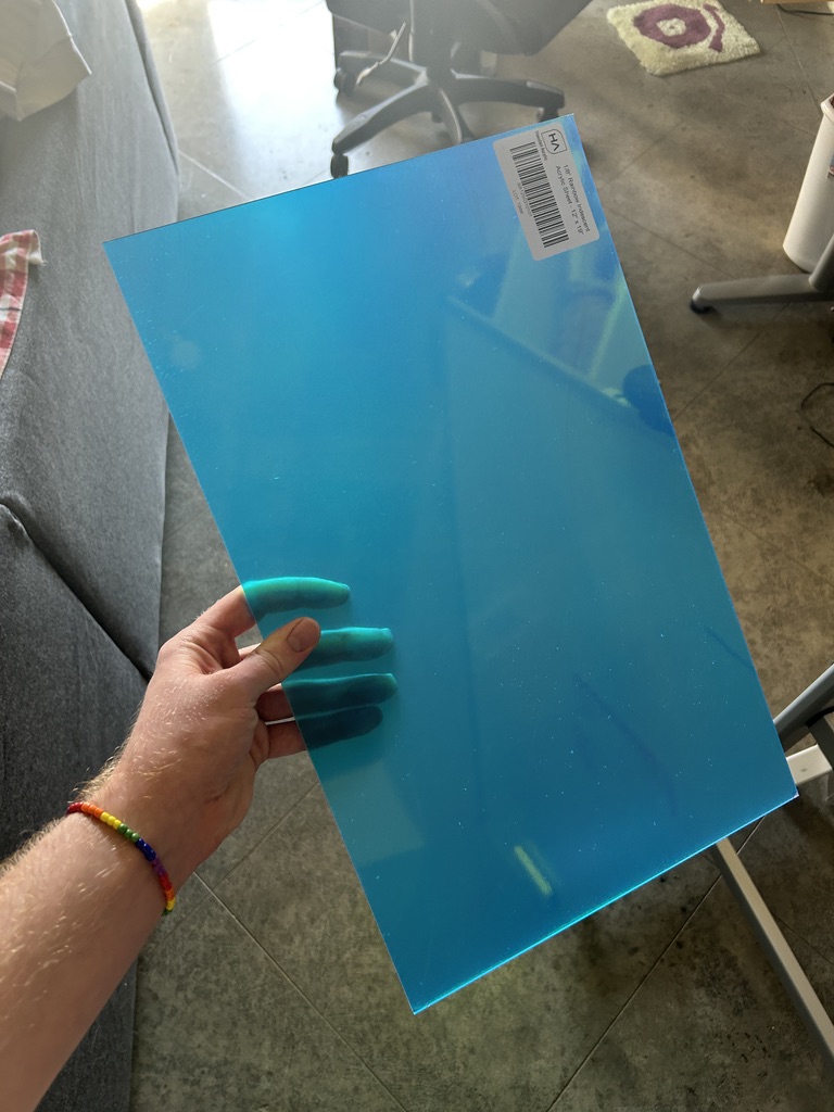
I plan to go to Asmbly tonight to make the cut! I also adjusted the tolerance to be 0.20mm instead of 0.15mm on the pieces for Dolores for a tighter fit. Hopefully I can put the pieces together without the need for superglue. If it's tight, I'll keep it for Edna too.
The Cut
Well that went...
The first thing I did upon getting to Asmbly was cut new pieces for Dolores to test the 0.20mm notch tolerance. The notches were just a bit too tight. One of the pieces even cracked. I ambiguously decided that 0.17mm was the "magic number" for tolerance on the Dorian laser so I just went ahead and made those modifications in Fusion 360, re-exported the DXF files, and laid them out on the cut sheet in Lightburn. For all of the pieces I had to use the entirety of one sheet and about half of another.
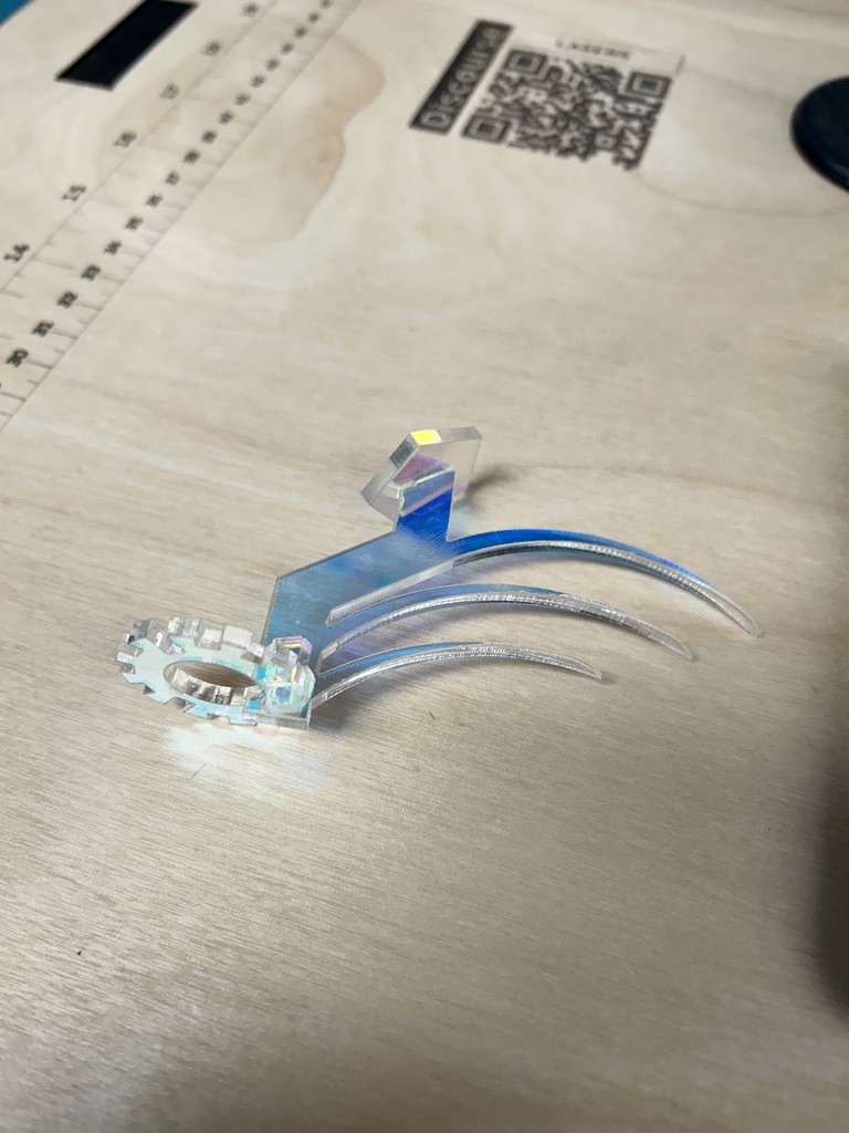
I made a few test cuts and decided that 100% max power at 30 mm/s was the right setting. I then cut out some pieces of Edna's parts to test the fits. Because I didn't want to mess up the laser's origin, I used a flathead screwdriver and tweezer to remove these pieces from the cut bed, and they came out fine. This information is important as it will come back to haunt me later. The fit was really good:
Then, it was time to hold my breath and start the cut.
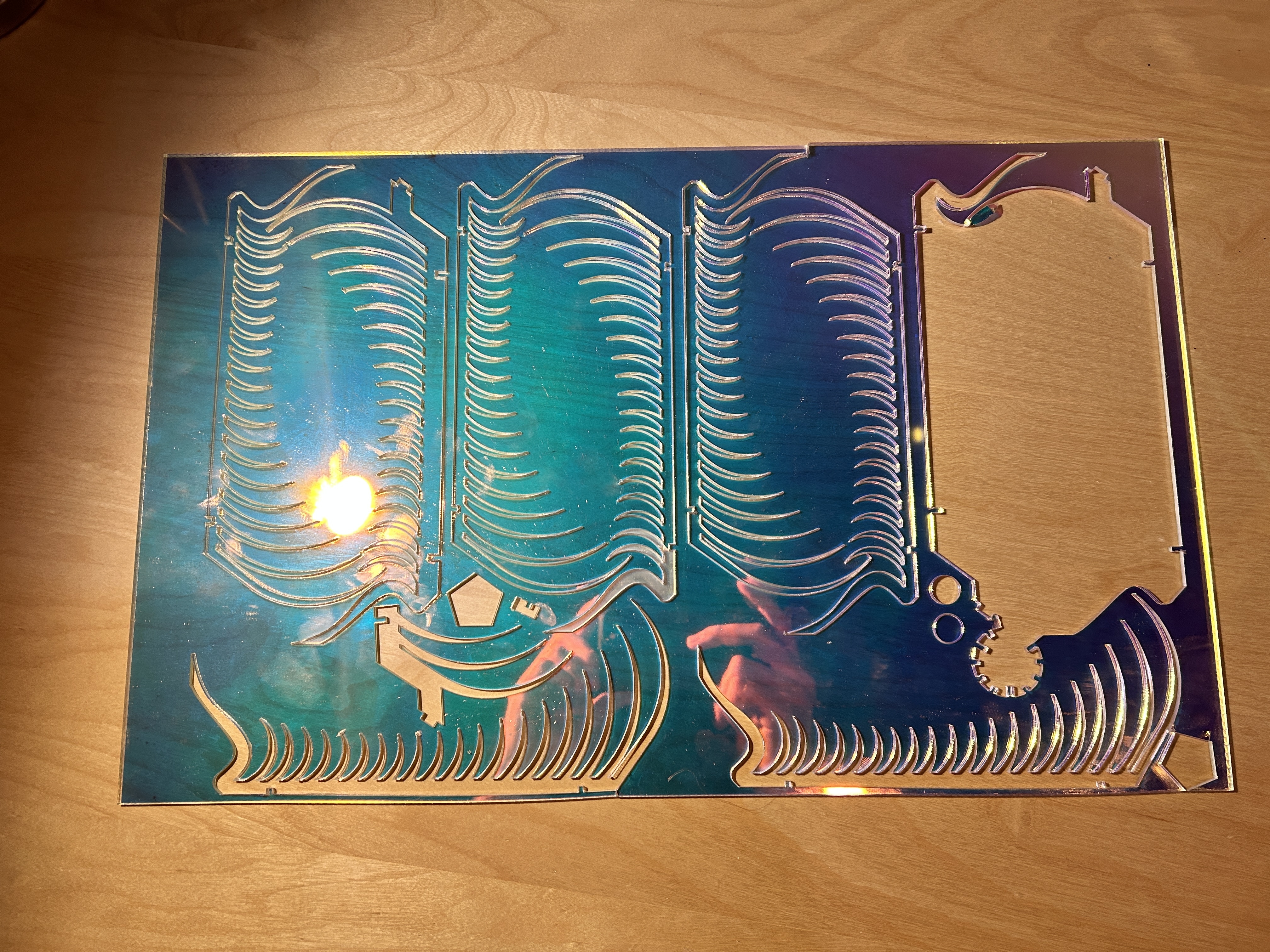
The pieces in the sheet above are still stuck in the sheet. SOMEHOW, I messed up my cut settings and had to resort to popping the support and decorative pieces out of the acrylic. One thing about 1/8" acrylic is that it's thin enough to be broken easily. I had to be super careful about how I popped these pieces out of the acrylic. I had to apply pressure in the right places to remove the feathers from the sheet without breaking them. I still broke a few of the pieces.
Another thing about 1/8" acrylic is that it's sharp. I cut myself a few times trying to remove the pieces from the sheet. And some of them weren't budging.
Time was running out in my booking and I decided to use the entirety of the second sheet and cut a bunch of spare pieces. I lowered my settings to 28 mm/s instead of 30 mm/s. This was enough to remove the pieces from the acrylic quite easily. What I SHOULD'VE done during my test cuts was cut an entire part, remove the sheet from the print bed, and see if it was easy to remove. Then, I could have placed the sheet back in the bed and reset the origin. The shortcut I took ended up costing me over half a sheet of the acrylic and it gave me three finger cuts in the process.
I was only able to salvage one of the support pieces from the "botched" sheet, and I only cut two on the second sheet. The support I salvaged had a bunch of extra plastic lodged in between the top two feathers. I took some diamond cutters and tried snipping as much of the material out of the cut as possible, but in doing so, I snapped the top feather off of the piece. I resorted to fixing it with some super glue.
After the semi-miserable cutting experience, I had all the pieces to put the final build together. At this point, I didn't know if I was going to leave with a finished product or not. I had no more space on my material, so if I messed up any of the pieces, I would have to somehow save them from the first sheet, which seemed likely. So, I proceeded with enough caution to make one more mistake.
I washed the pieces off to remove the dish soap, removed the backing plastic, and started assembling. I accidentally broke off the foot of the piece that was missing its top feather. The nice thing about this model is that there are so many pieces to distract you from the fact that I broke it a few times.
I meticulously glued all the pieces in place with some glue (which, to be honest, I don't think I even needed) and luckily, I got my final product!
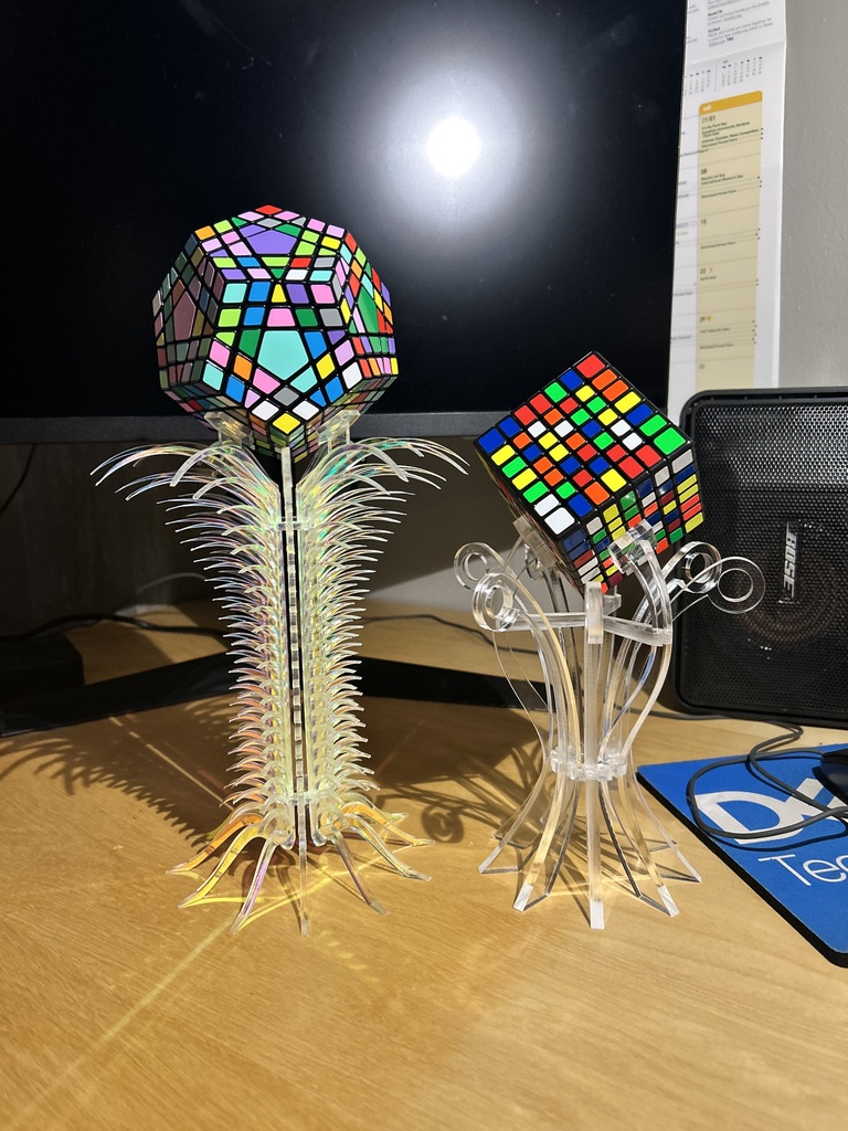
I think this turned out to look really wonderful. I think it totally encapsulates the glamorous supervillain vibe that I was going for, and the iridescent acrylic looks REALLY good. I'm super proud of this! Even with the non-ideal cut settings, I'm gonna go ahead and say that we're squarely in "good enough" territory and we can go ahead and move onto the next (and most likely last) design.
For the last design, I want to honor the first Rubik's Cube I ever solved. I want to put it on the tallest structure and I want it to be made of gold acrylic. I also think that this one should be more "angular" and feature straighter lines. I want this one to really feel the most like a trophy. There are lots of ideas that I have for this one. Here are some things I could potentially play with:
- Having multiple profiles for decorative spines
- Multiple "tiers"
And some sketches...
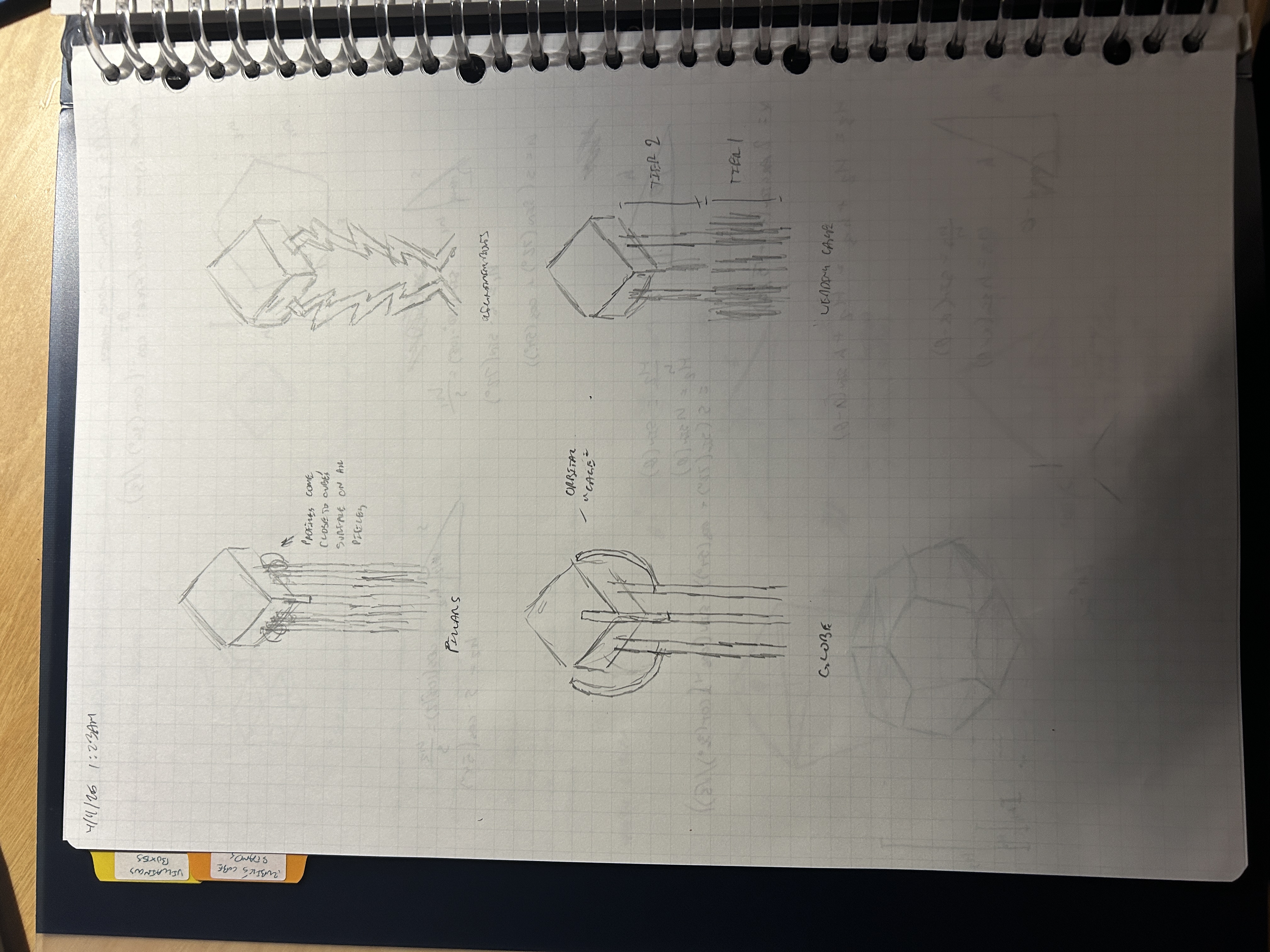
I'm proposing a deadline of 4/18 for this last model. I didn't even have the last one modeled on Saturday. And it was finished by Thursday. I think this is a reasonable deadline. Plus, I'd like to work on something else lol.
4.15.25 - I don't know what I'm doing anymore
After thinking about it a little longer, I decided to try and combine the lightning bolt and wedding cake design aesthetics into my last trophy. After spending a few hours in Fusion, this is what I came up with.
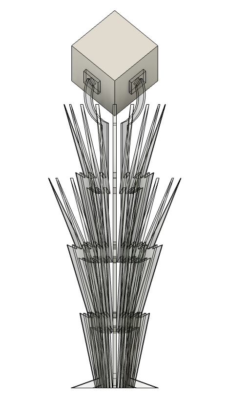
Do I think this looks bad? No, no I don't. However, there are quite a few things I don't love about it:
- The circular arcs that support the cube feel like an inconsistent design choice with the rest of the model. It's like taking the head off of a GI Joe and putting it on a Barbie doll. Or I guess it would be the other way around. Not sure.
- It's very spiky. I already did a spiky one.
- The wedding cake feature is making this feel a bit broad in comparison to the cube size. I.e. the proportions feel a bit off... Shouldn't it be narrower? How would I even make this narrower?
Justin said this one reminded him of Game of Thrones which I guess is pretty cool. However, instead of pursuing this design and refining it, I would rather scrap it and do something else.
Here is a photo of the notebook entry I made while making this one. I have no idea what I was trying to communicate or how this was helpful to the design process in any way. Not sure why I'm including it in this entry either. Anyways, here you go:
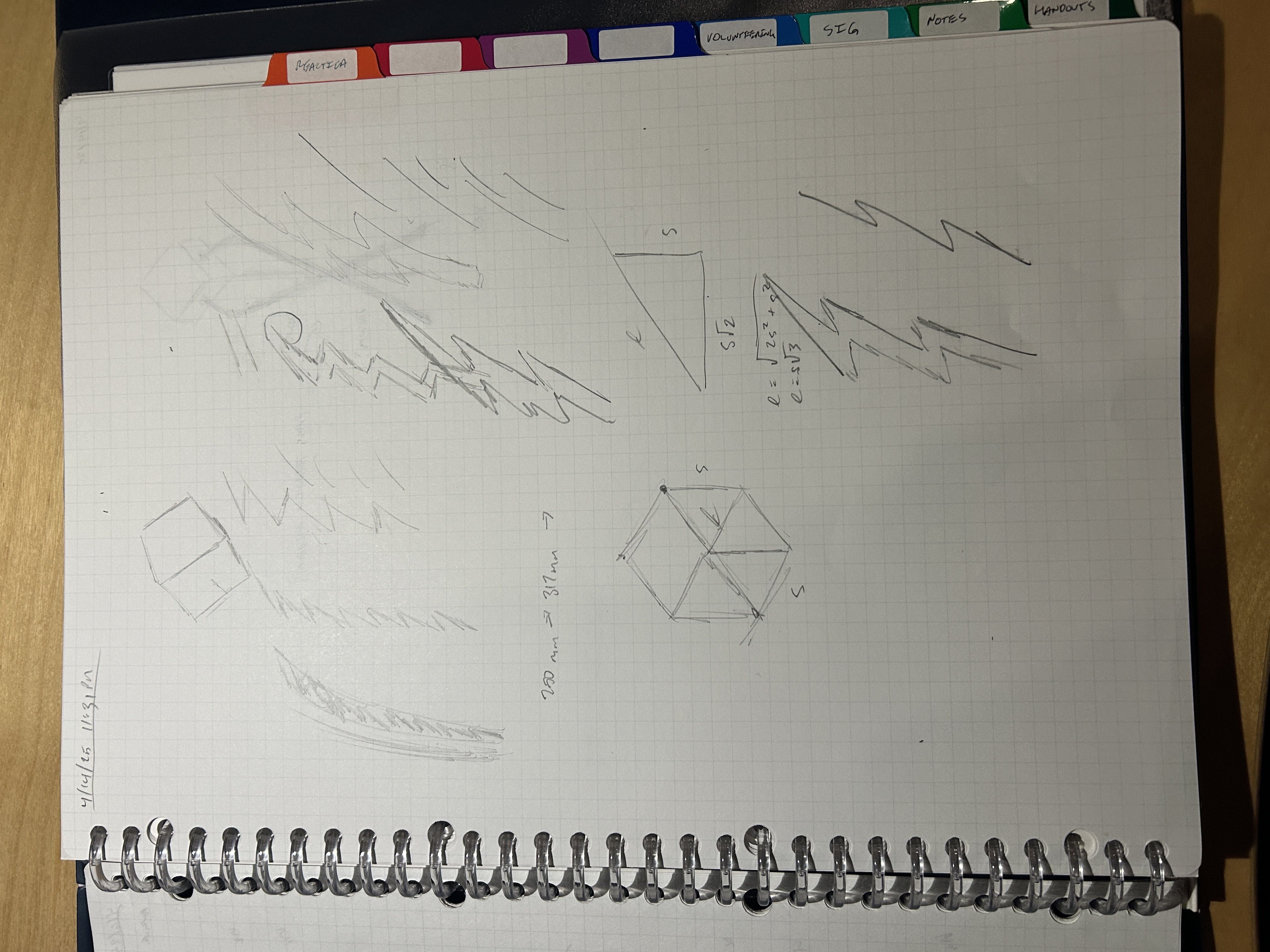
I think I will shelf this project for the time being while I focus on some other things. Hopefully I'll return to it quickly once I feel inspired again.
4.20.25 - Cynthia v1
Consider this project officially unshelved (that didn't take long).
While helping with IT at the recent Maker Showcase at Asmbly, I came up with a new idea for this trophy. Ironically this is the same room where I conceptualized this project in the first place. I don't know what it is about the energy in that room, but I'm convinced that it breeds creativity and inspiration.
Here's the initial concept sketch:
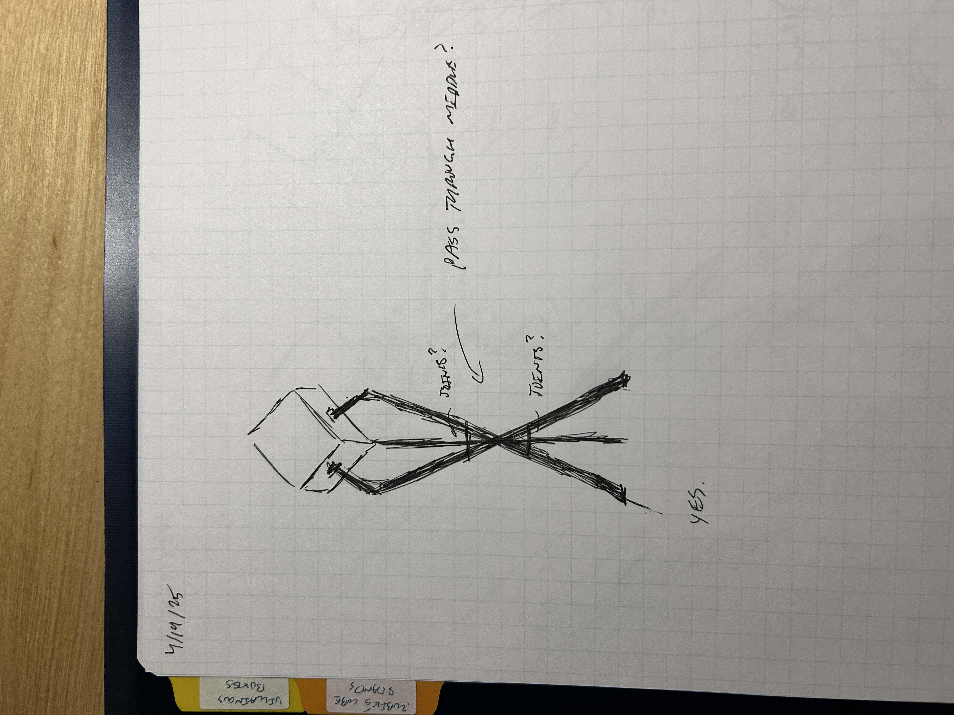
As you can tell by the "YES." written underneath the sketch, I felt like I was onto something with this one.
I wanted to break free from my obsession with curves and pursue something with straight edges. I feel like this concept, as simple as it is, still looks quite elegant. I have yet to see if I can make one of these without an hourglass silhouette but for now, I'm in pursuit of glamour and opulence.
As you can see by the affirmative "yes" written underneath the sketch, this concept is the one. The challenge is that there are multiple ways that this kind of silhouette could be sculpted. I produced some preliminary designs to see if any of them stuck.
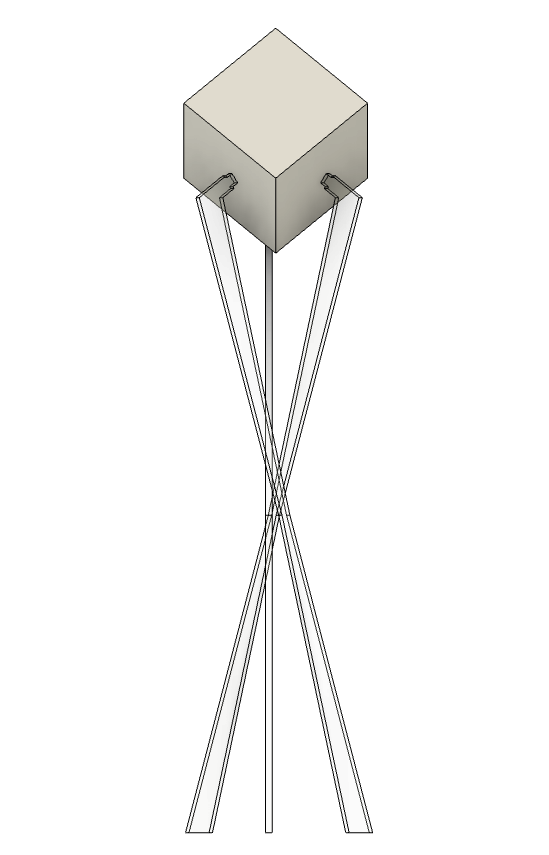
In this one, the support pieces actually pass by each other near the center of the sculpture. I designed the pieces to pass through the middle initially, but before duplicating them, I shifted them sideways by a few millimeters. This way, the pieces don't pass through each other, which would be physically impossible according to physics as we understand it. However, the cube is no longer supported in the center of the face. Honestly, I think that's okay.
I think that this is a very compelling design aesthetic. All of my other pieces have been sculpted from the center outwards. This is quite different, which is a good thing. I was looking for an aesthetic that would separate this design from the others.
I also made a similar version in which the pieces pinch towards the middle but don't cross through the middle.
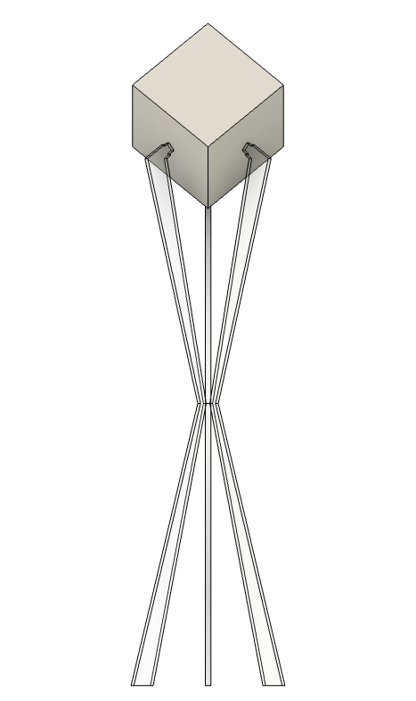
This was originally meant to be a backup in case the other version was too difficult to implement. I liked both versions. Upon asking Justin, my design consultant, he indicated that he loved the design concept of the first. So now this one is a backup again.
These are both very bare bones models, and they need some more oomph to them. I'll look into adding oomph at a later time.
4.22.25 - Cynthia v1 (cont)
I made another version of the "pass-through" concept in which the pieces are rotated instead of translated to avoid each other. I rotated them through the axis that passes through the center of the pad such that the cube is still supported in the middle of the faces.
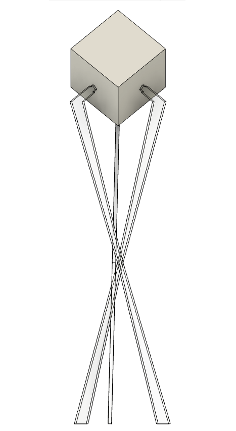
I don't think this is super revolutionary in comparison to the translated version. If anything, it's a little worse, since the feet are no longer parallel to the ground. The model would be sitting on the edges instead of the faces. Would it still stand? Sure. This just feels dirty and I can't explain why.
Anyways, I tried adding some oomph to the original "pass-through" model. I added multiple decorative pieces to the upper half of the body that protrude upwards and outwards. It looked neat but the "pass-through" design concept was quickly lost. I decided to scrap it so quickly that I forgot to take a photo of it. I might try re-implementing it with the "pinch" model.
I was kind of disappointed that it didn't work out. I shifted to focusing on how I could better highlight the "pass-through" concept. That's when I decided to increase the amount of supports from 3 to 12.
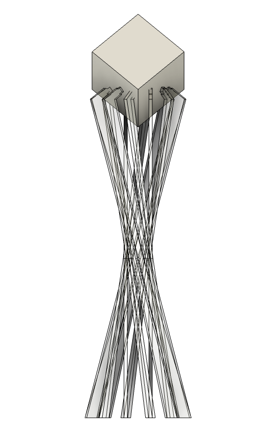
This is the one. Absolutely. Without a doubt.
I played around with it a little and moved the contact point to lower on the cube's face.
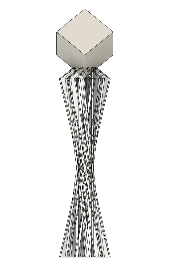
Yeah this is absolutely the one. We're getting somewhere.
I think this is a remarkable sculpture, a creative re-interpretation of the hourglass silhouette, a distinct-enough design from previous iterations, and most importantly, it's really cool to look at.
There's a lot to be played with here. This is kind of complicated to model and tinker with in Fusion. I think I need to re-evaluate my parameters. That said, what if the pieces weren't simply straight-edges? What if they had frills and form? What if the pieces were extended differently towards/away from the cube? Should I revisit a rotation model instead of a translation model?
This is the kind of design shift that has kickstarted the gears back into turning and opened new avenues to be explored, and if there's any indicator that this is the right design path, that's it. Can't wait to see where this goes!
6.10.25 - Cynthia v1 (cont)
After much deliberation and a long break fueled by procrastination, I think I've arrived to something I am good with cutting...
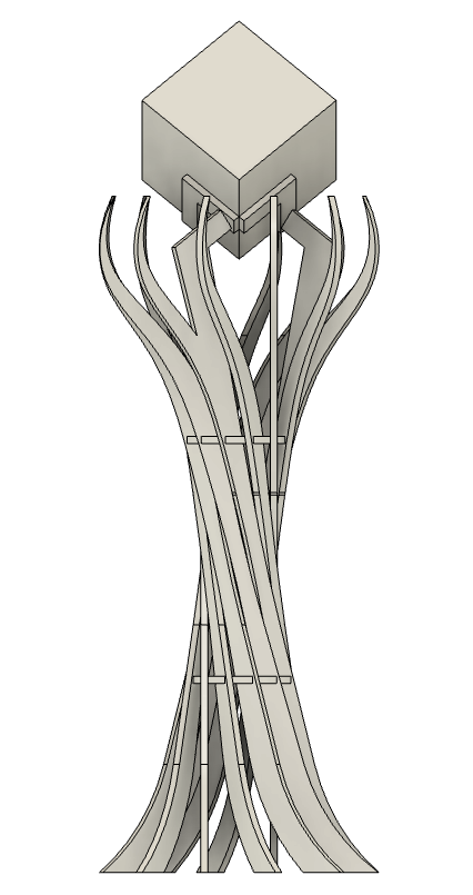
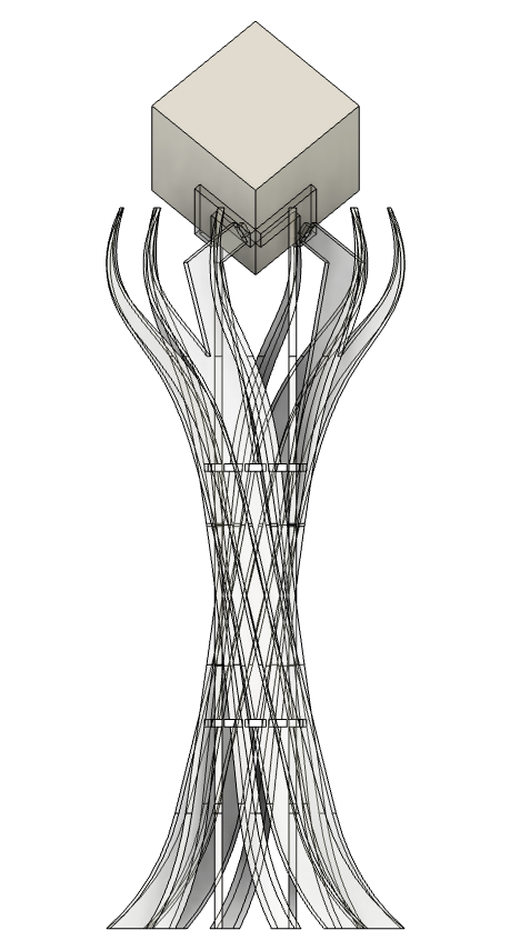
I plan to take these designs to the laser cutter tomorrow. I recently bough some more iridescent acrylic for this model. We'll see how it goes!
I need this project to end so I can finally do something else.
6.11.25 - The Cut
The cut went... interesting...
After finding the right the laser settings, I did some test cuts on the pieces with some very unfavorable results. First, the joint that was holding the pieces together was burning. Here is how the pieces were designed:

This is what the tolerance-adjusted sketch for this piece looks like. This sketch was exported as a DXF and cut on the laser:
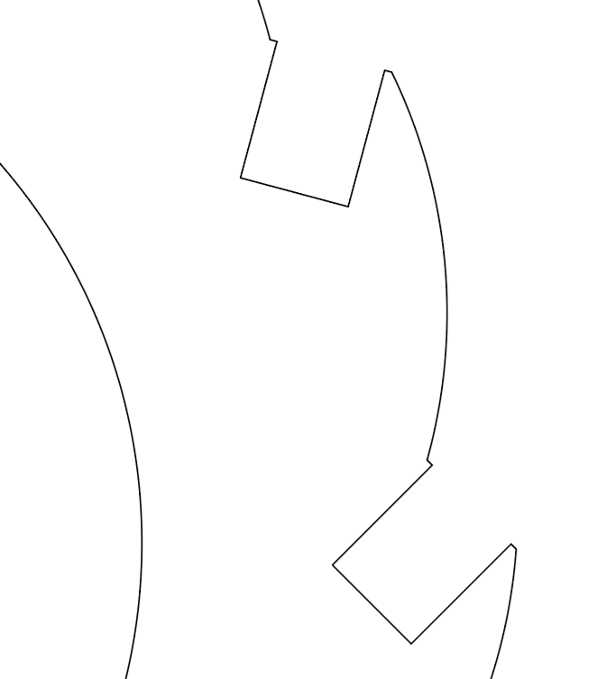
You'll notice that I connected the tolerance-adjusted notches with straight lines to the curves. When I was cutting this piece, I noticed that the laser was dwelling on these straight lines for a little too long. The flashback from these cuts, in some areas, ended up melting the material. As shown below:
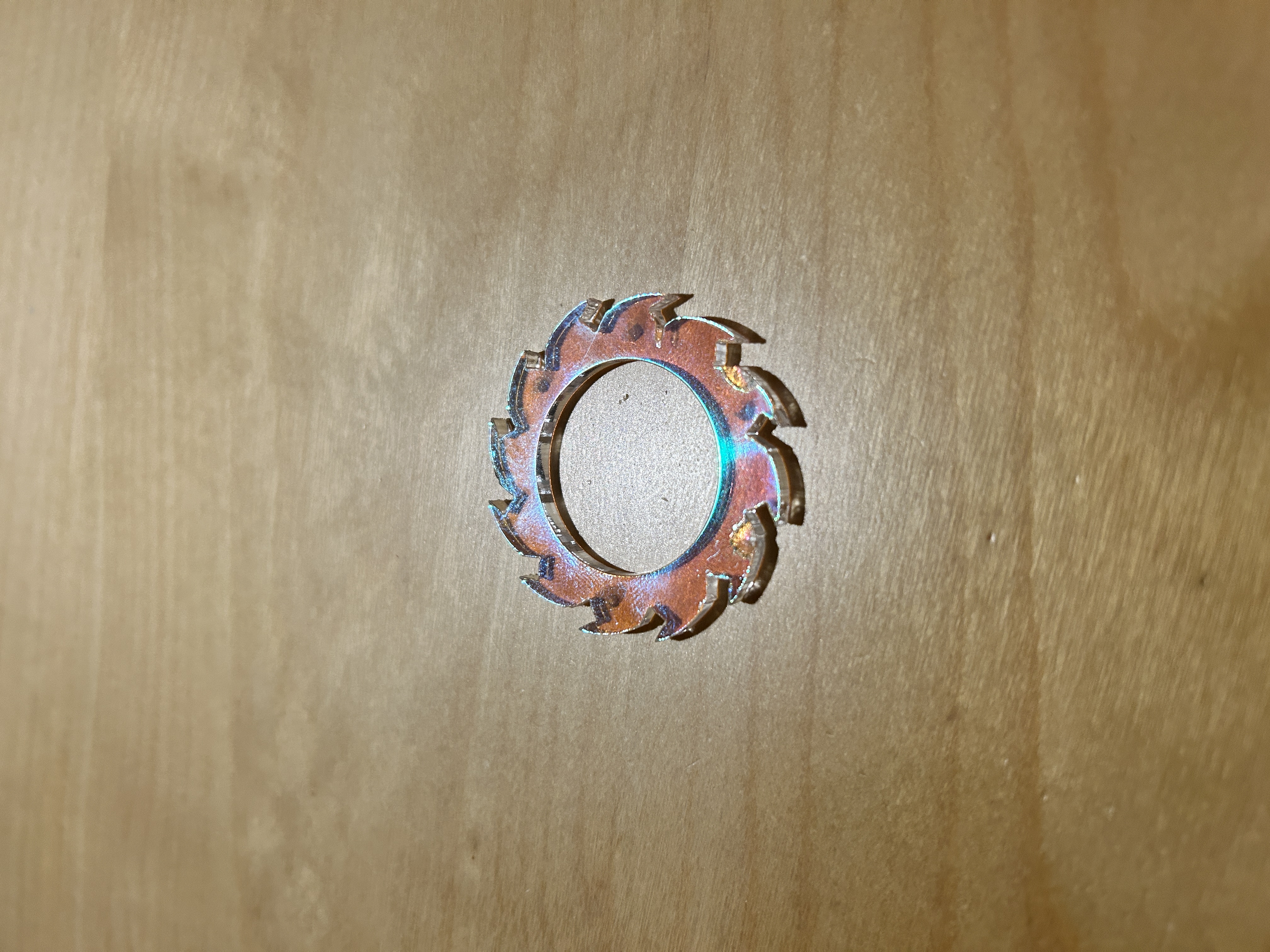
To fix this, I had to re-design the pieces. After creating the tolerance-adjusted notches, I created new curves that connected directly to the notches' endpoints, rather than lines connected to the projected curves. I set the radius of the new curves to be equal to the original curves (which are shown as dotted lines below).
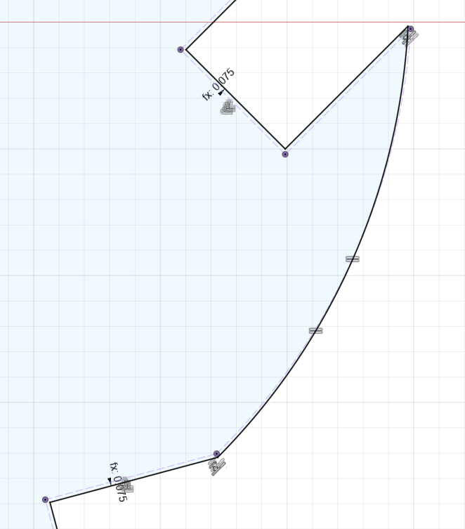
These cut with little to no issues.
Still, after these modifications, the notches in my test pieces were a bit too tight, and they kept breaking at the notches. After taking another look at the Fusion document, I realized the material thickness was misconfigured. I had to do a few more test cuts, adjusting the tolerance between each, before arriving to something that worked well.
Then, I hoped for the best and cut all the pieces. I took them home to clean and assemble. This was the final result:
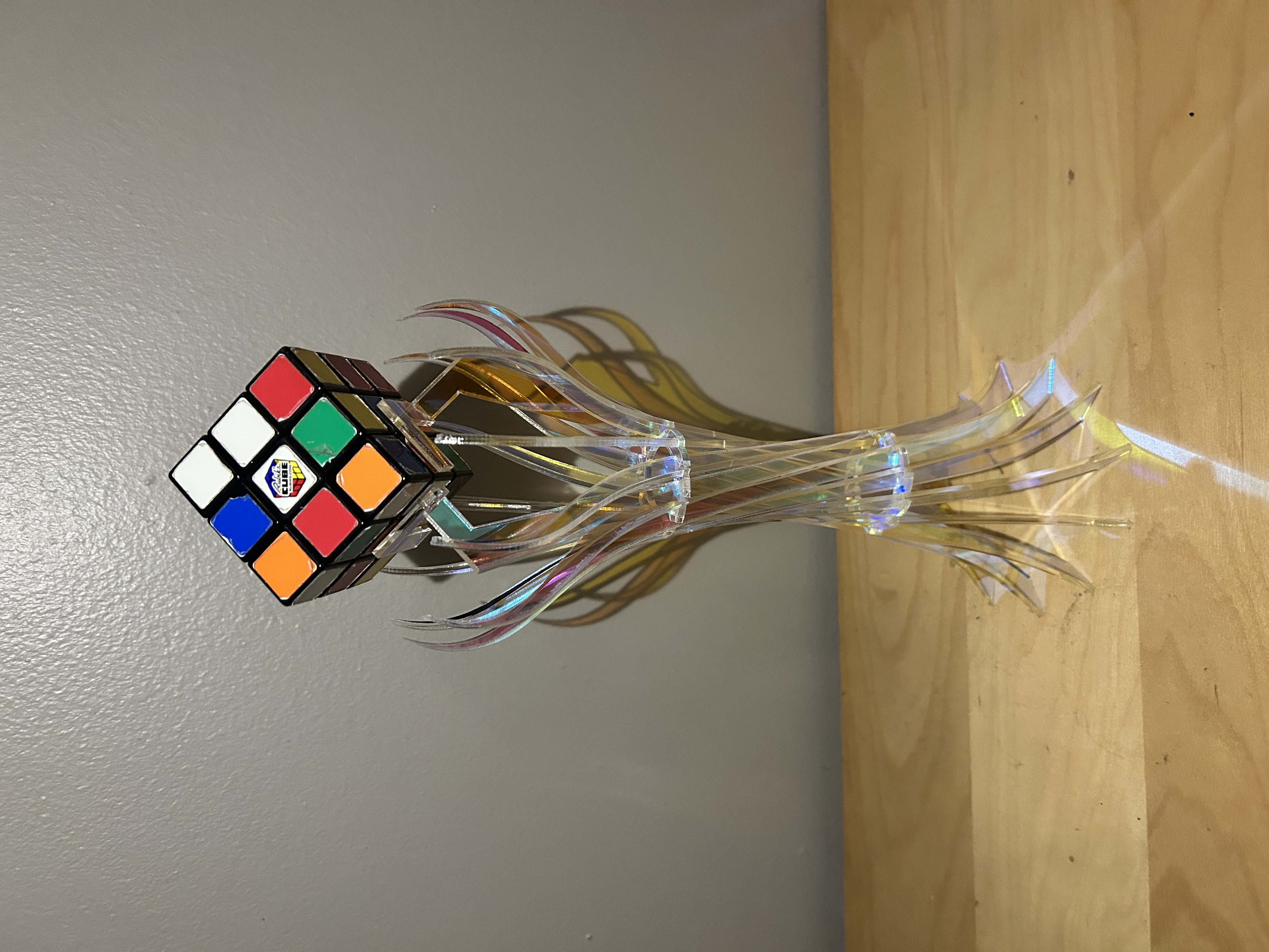
I think it looks awesome! Two of the pieces broke during assembly but I managed to save them during glue-up. I'm really thrilled with how this turned out. It looked better than I could have imagined it in Fusion.
I managed to keep all my cuts on one sheet of material, even though I bought two. Here's my material utilization (the smudged finish is residual dish soap from pre-treating the material):
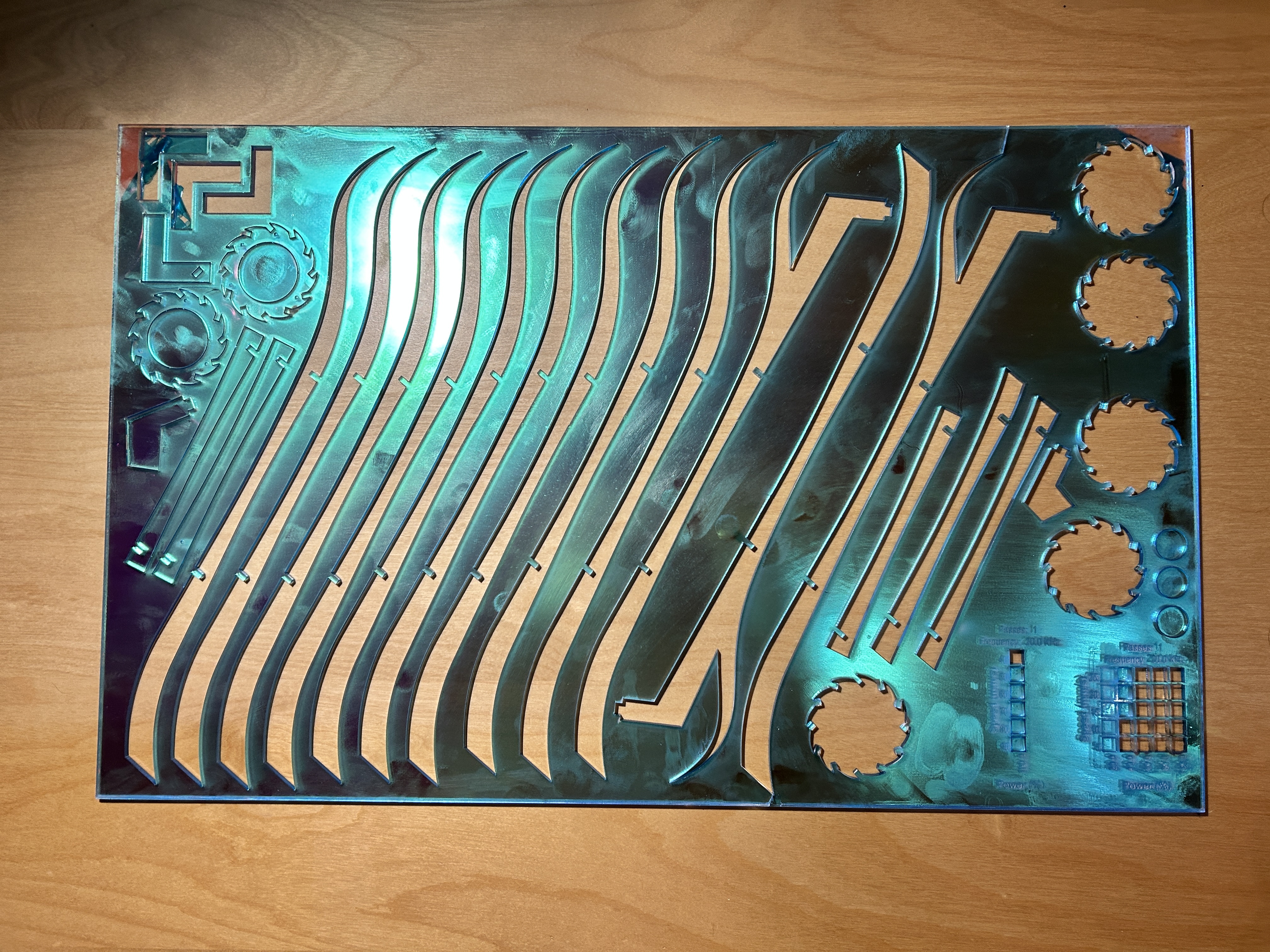
I'm pretty stoked that I managed to keep everything on one sheet!
6.16.25 - Mount Modification
I was observing the stand a bit after assembling it and noticed that the weight of the cube is pushing the pads apart a little bit.
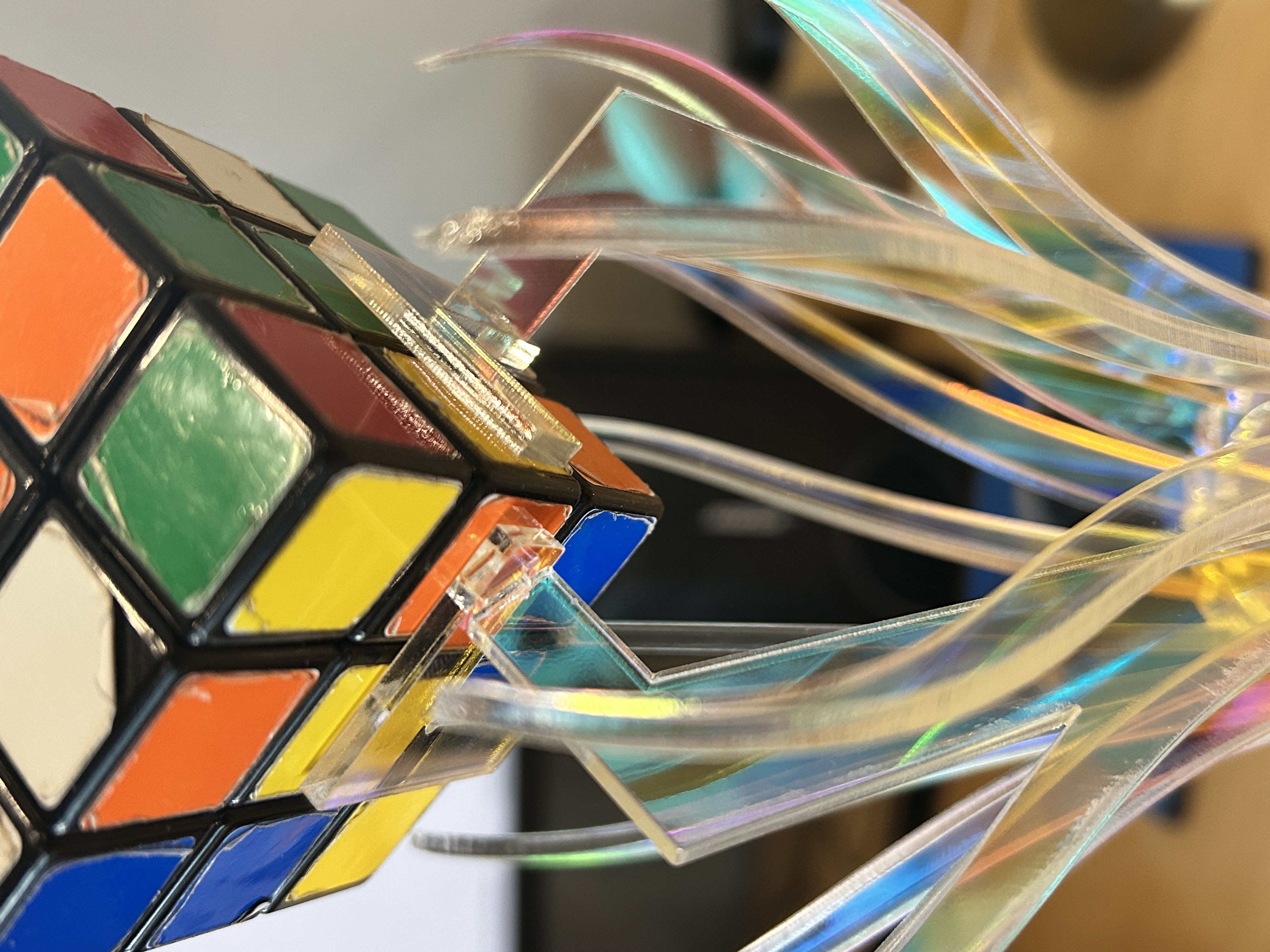
While this isn't a major design flaw, I would like to make these mounts a bit more stable. In Dolores, I had to design a separate joint to combat this same issue. However, the unique shape of Cynthia's mounts lends an opportunity to be much more subtle with the approach:
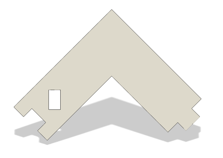
With this modification, the pads can now slot together.
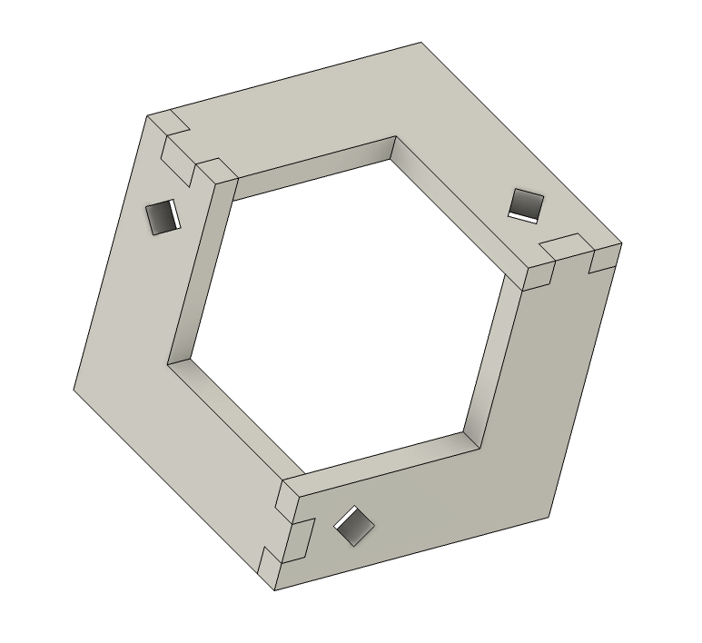
I'll cut these tomorrow and see if this solved the issue.